Fintech mobile app
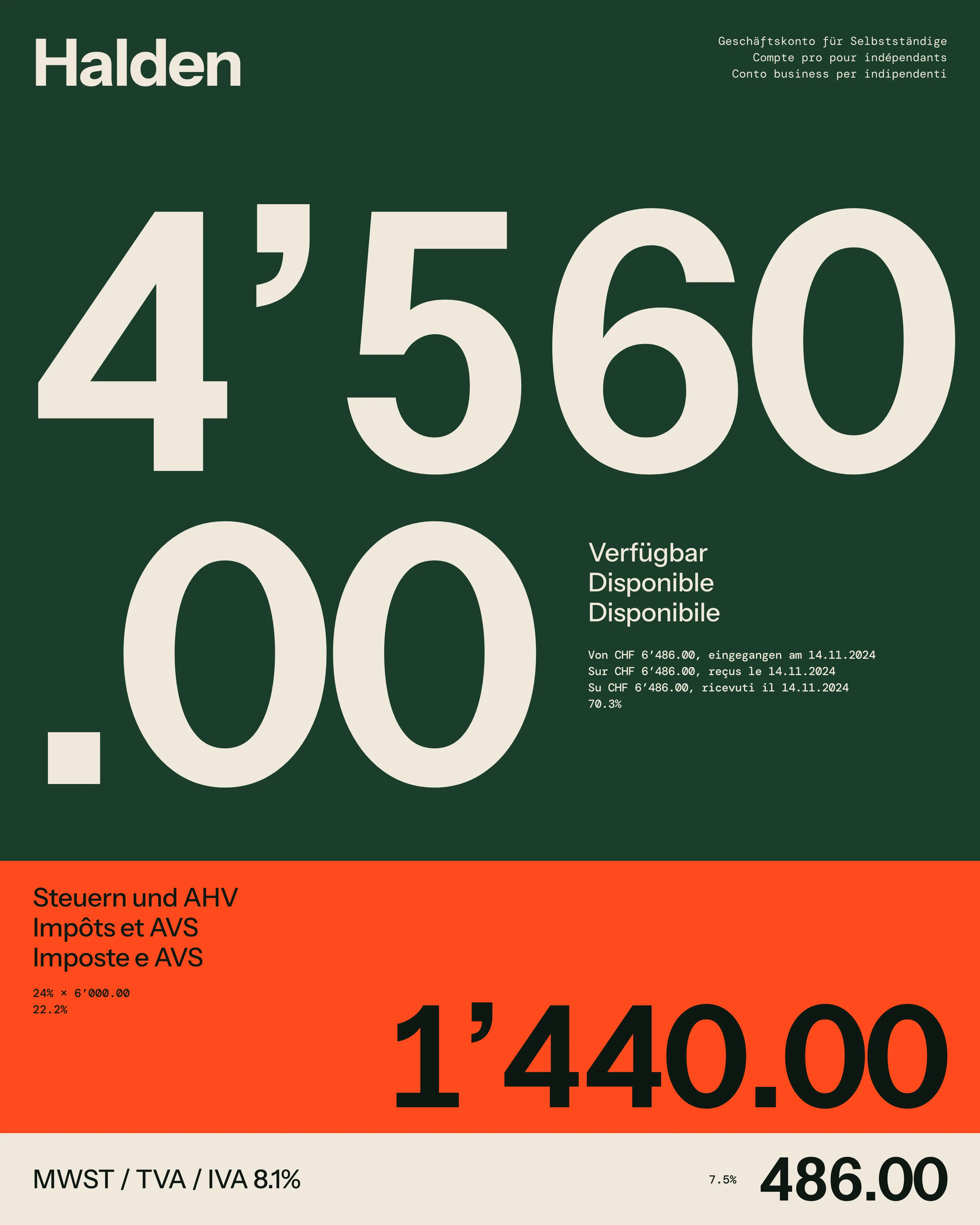
A Swiss business account for sole traders. The only large number on the screen is the money you can actually spend.
Brief
Halden is a Swiss business account for sole traders: photographers, carpenters, physiotherapists. Its one idea is that every incoming payment is split automatically, so VAT and the money for income tax and AHV sit in a separate balance, and the first number on the screen is what you can spend.
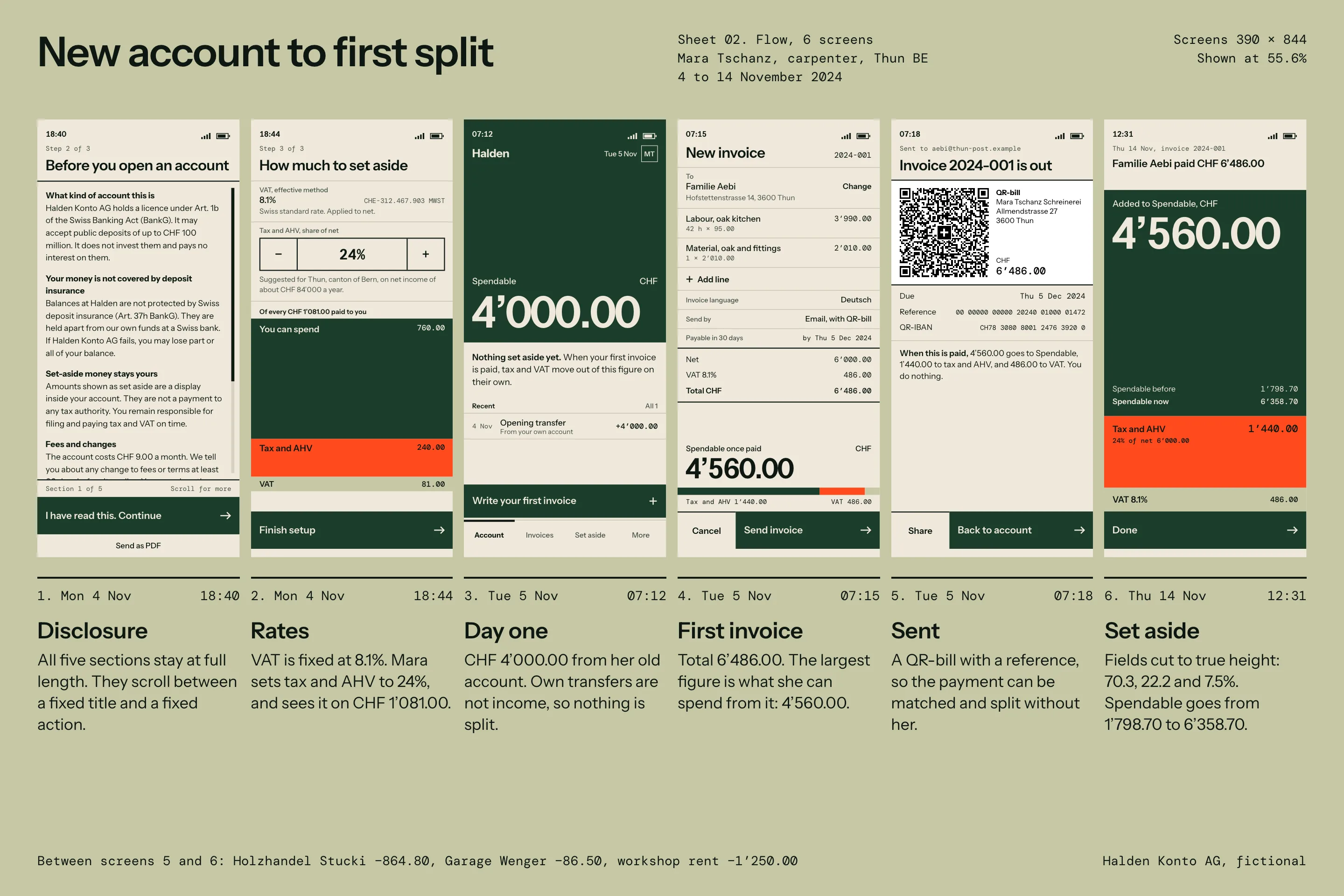
The founders had the splitting logic working and a prototype that looked like every other banking app. They asked me for the product design and the brand. I did all the work against one sample user: Mara Tschanz, a carpenter in Thun, with one oak kitchen to invoice in her first week. Every figure in these images comes from her ledger.
Constraint
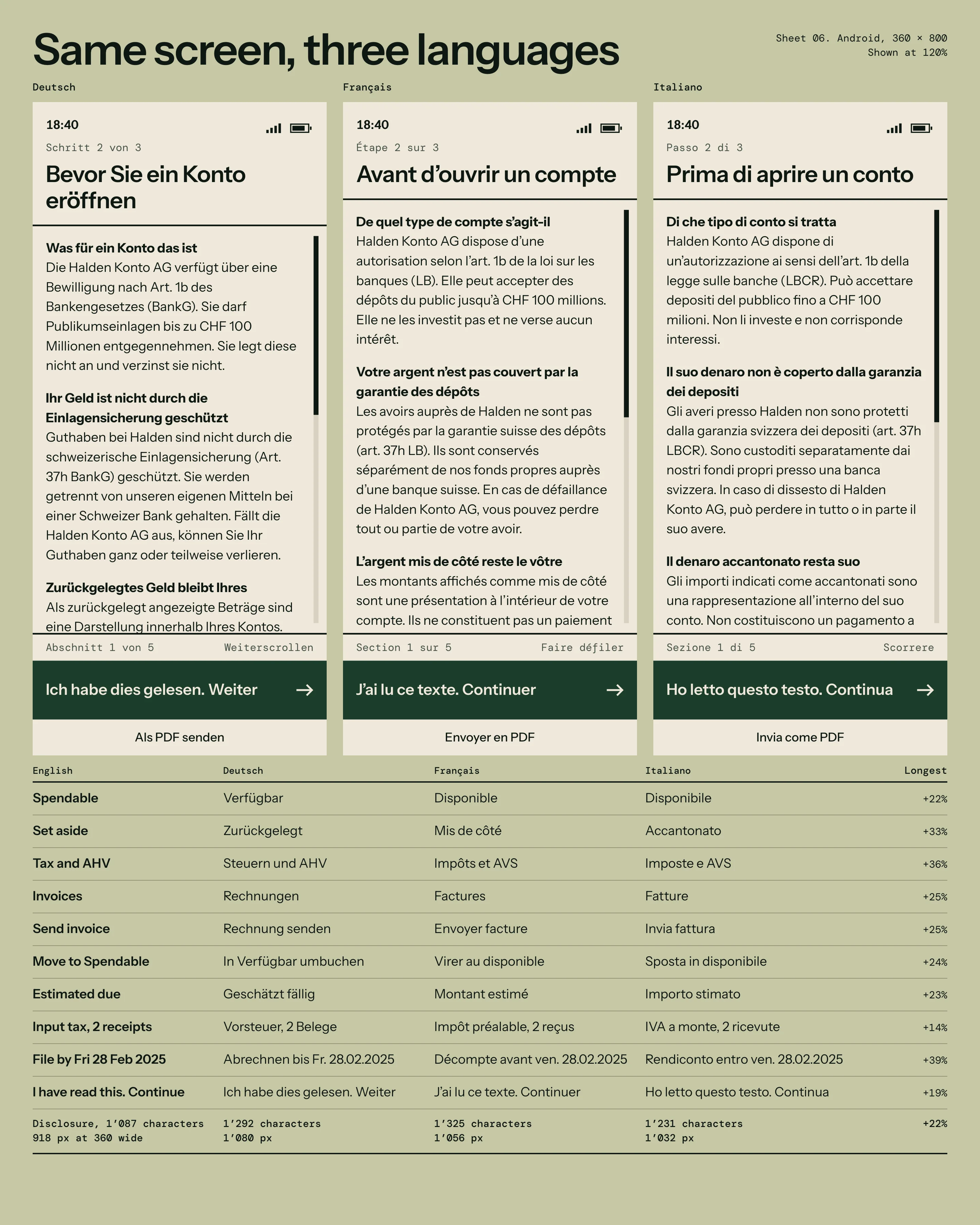
Four limits set the layout. The disclosure required under Halden’s Art. 1b licence could not be shortened or collapsed: 1’087 characters in English. German, French and Italian ran up to 39% longer on short labels and 22% longer on the disclosure. Everything had to work one-handed on a 360 px wide Android phone. And many users open the app on site, with dirty hands, in full sun or in an unlit stairwell.
Decisions
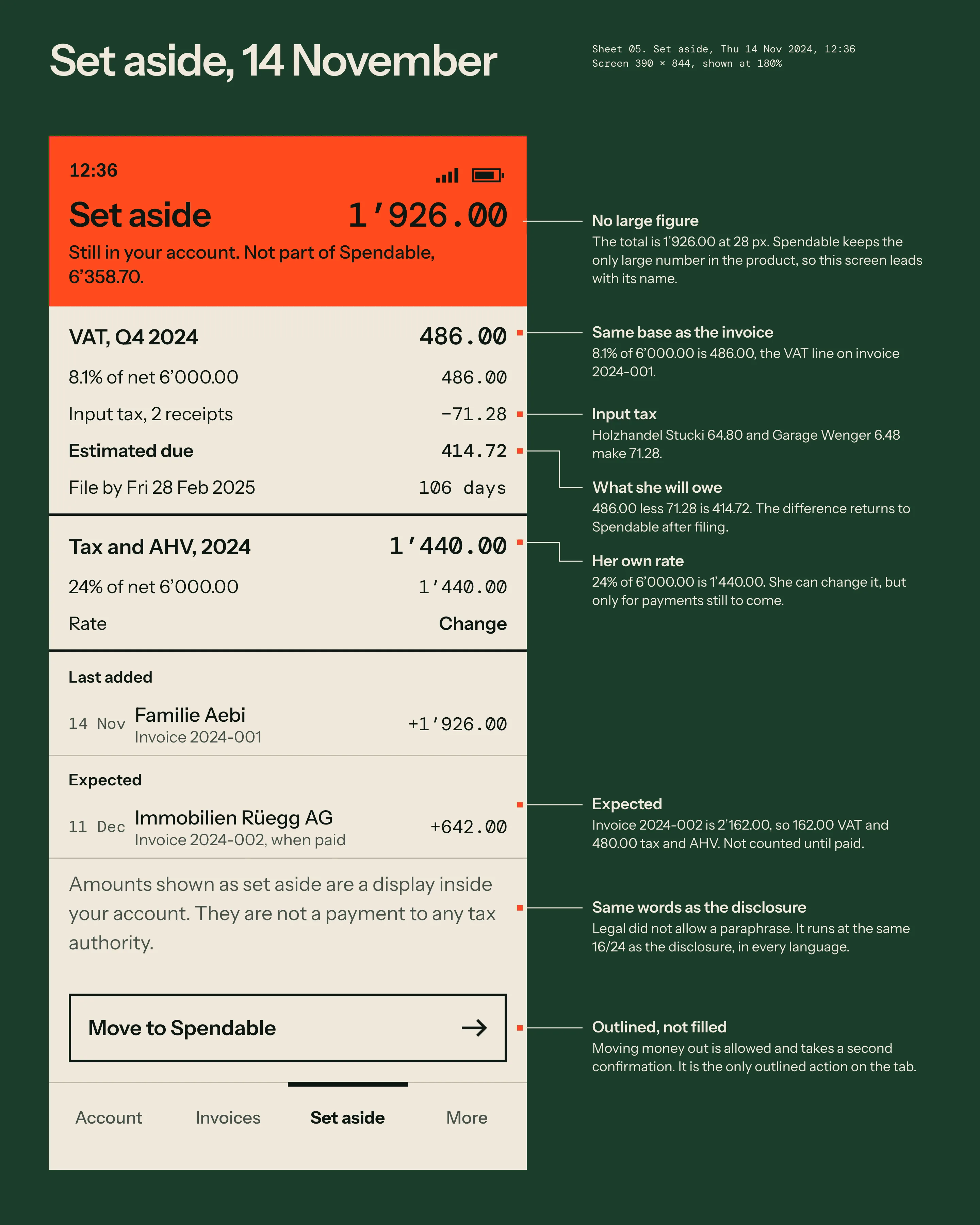
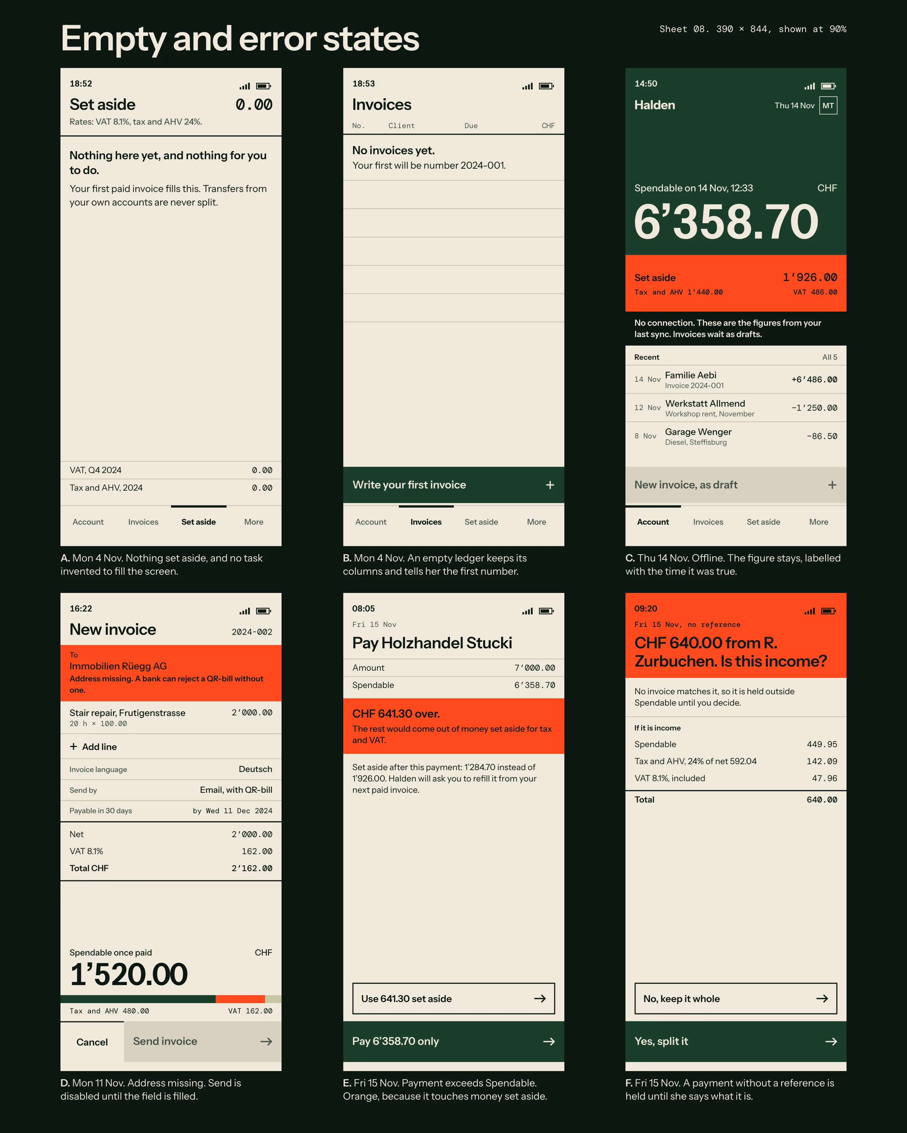
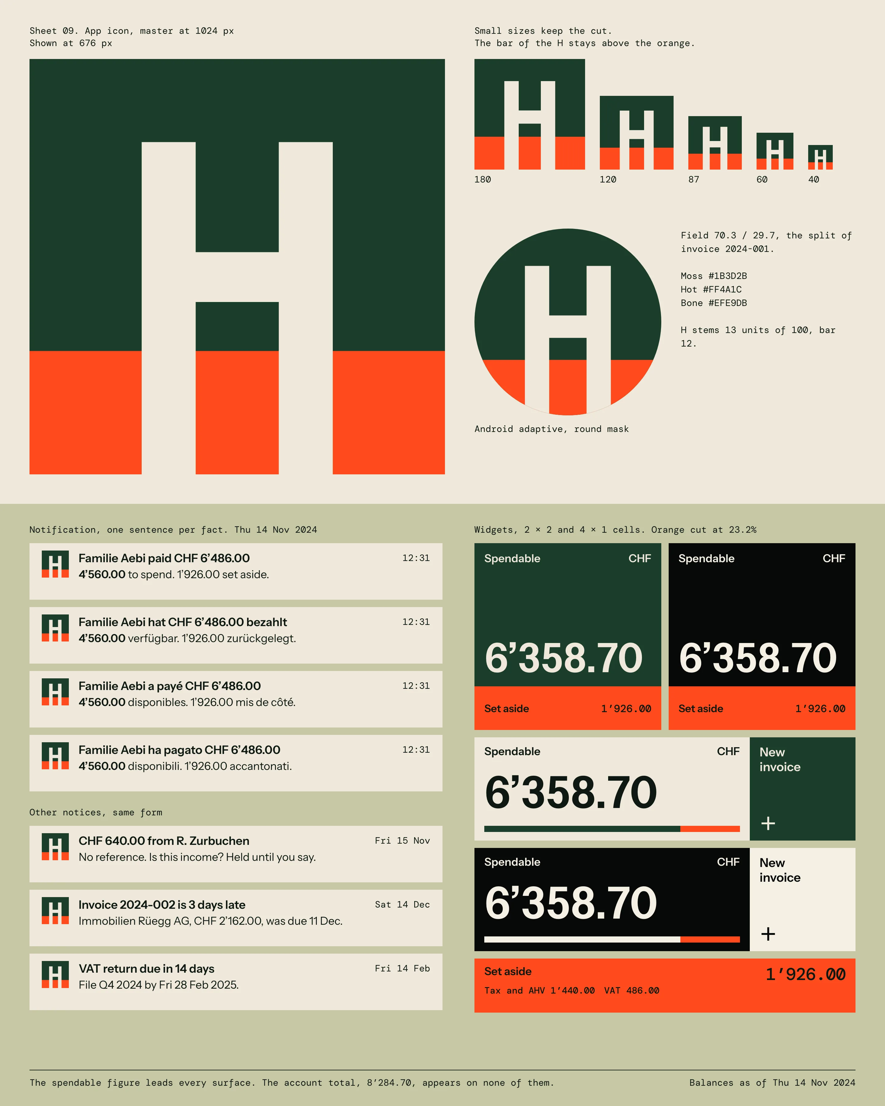
The prototype showed three balances at equal size. Testers added them up, which is the sum the product exists to stop people doing. I made Spendable the only figure above 28 px anywhere in the app, then cut the top of the first screen by true share: the orange block is as tall as the money set aside.
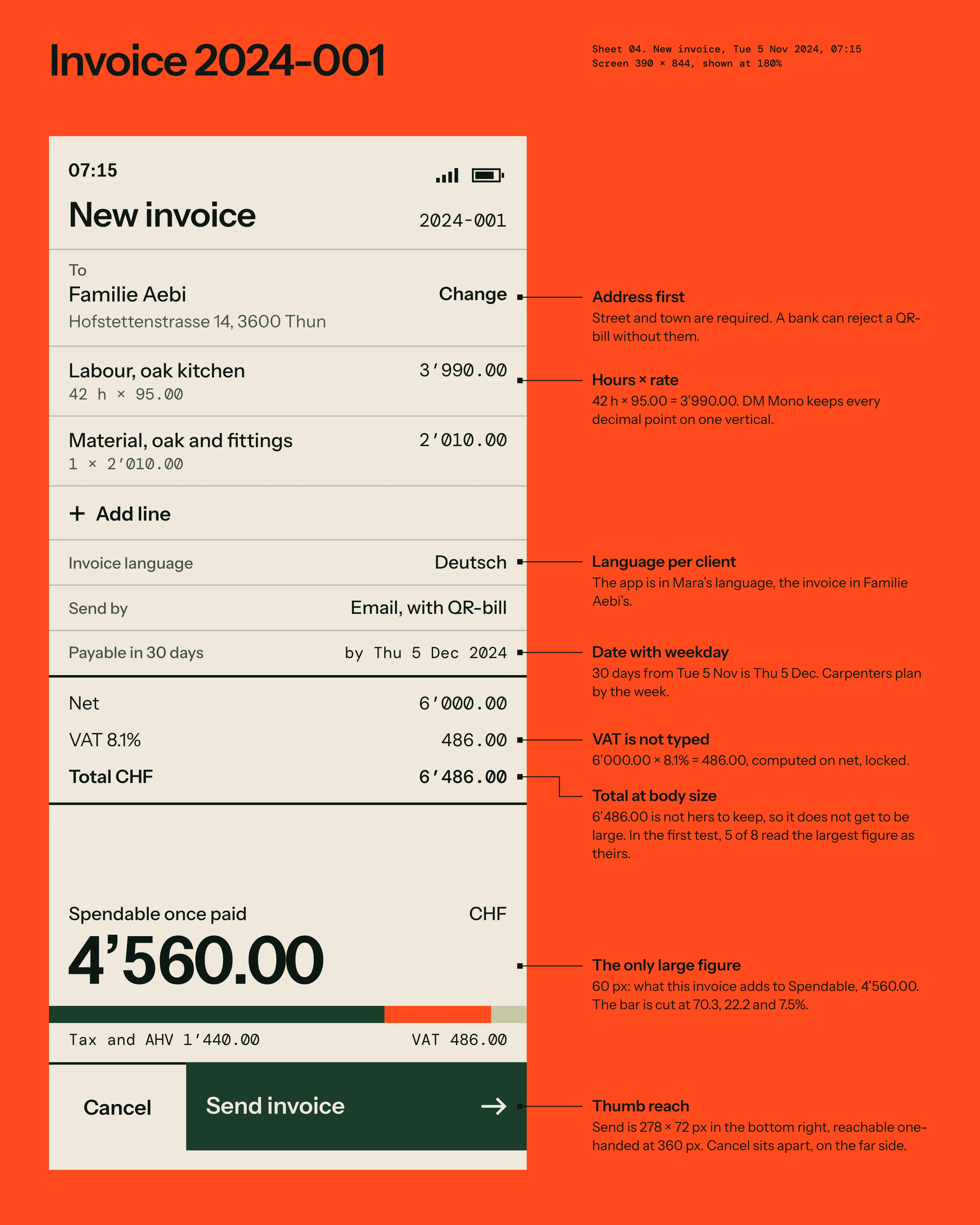
The rule held on the invoice too. In the first test, 5 of 8 people read the largest figure on the form as theirs, and at the time that was the total. The total of CHF 6’486.00 now sits at body size, and the 60 px figure is the CHF 4’560.00 she can spend once it is paid.
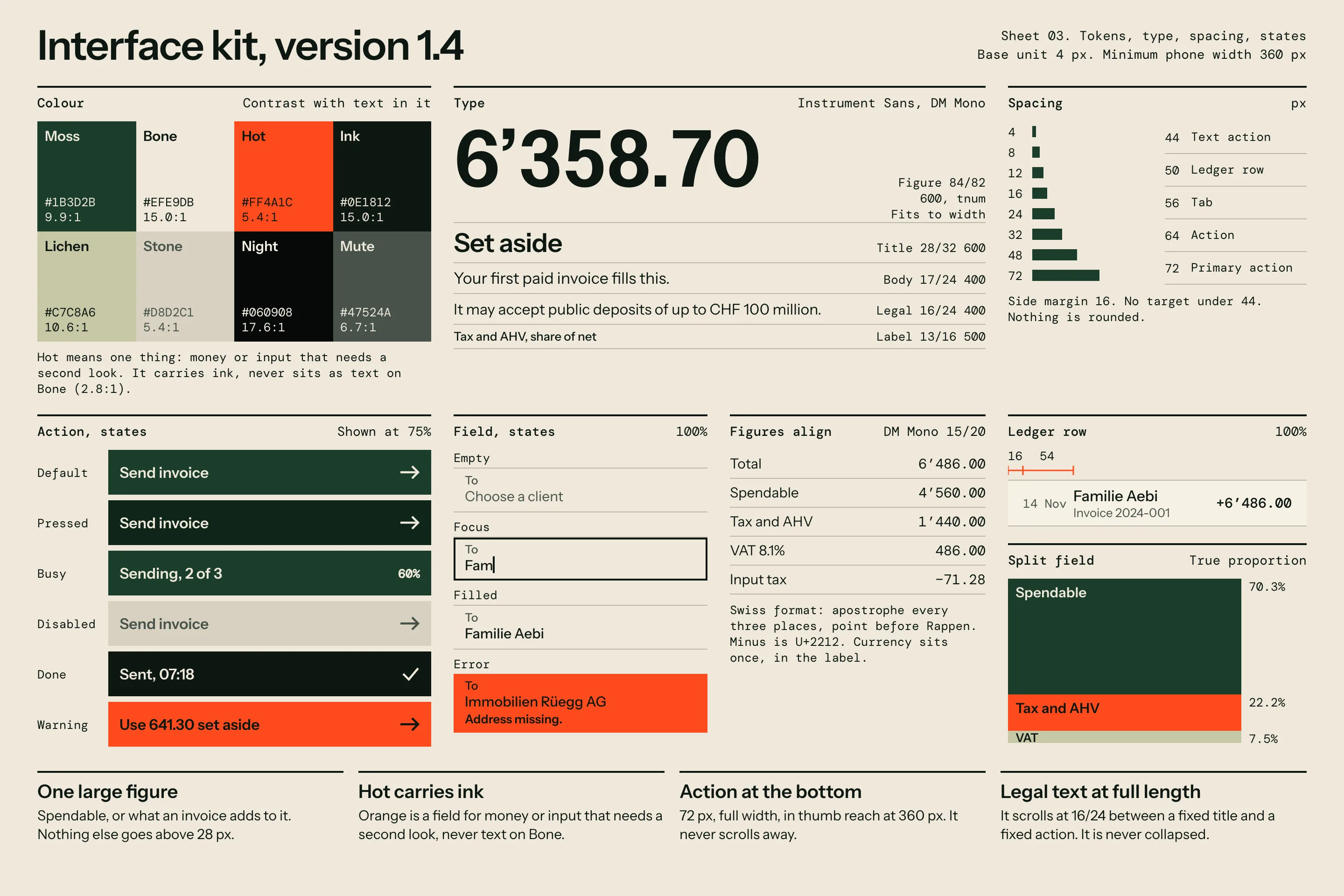
Amounts use the Swiss format with an apostrophe every three places. Instrument Sans sets the large figure with tabular numerals. DM Mono carries every column, because Instrument’s punctuation shifted the decimal points by a pixel in a ledger. I rejected the usual smaller Rappen: on a phone in bright light, 6’358.70 at one size was read correctly more often than 6’358 with a raised 70.
“We had three balances on the first screen and called that transparency. Ines took two of them away, and our support inbox got shorter.”
Text that scrolls
Legal rejected an accordion, since collapsed text does not count as presented. I then tried disabling Continue until the reader reached the end. 3 of 8 testers thought the app had frozen, so that went too. The final layout fixes the title above and a 72 px action below, and the text scrolls between two heavy rules with a visible track. At 360 px wide the English runs to 918 px and the German to 1’080 px. The layout is the same in both. Only the scroll thumb gets shorter.
Orange and low light
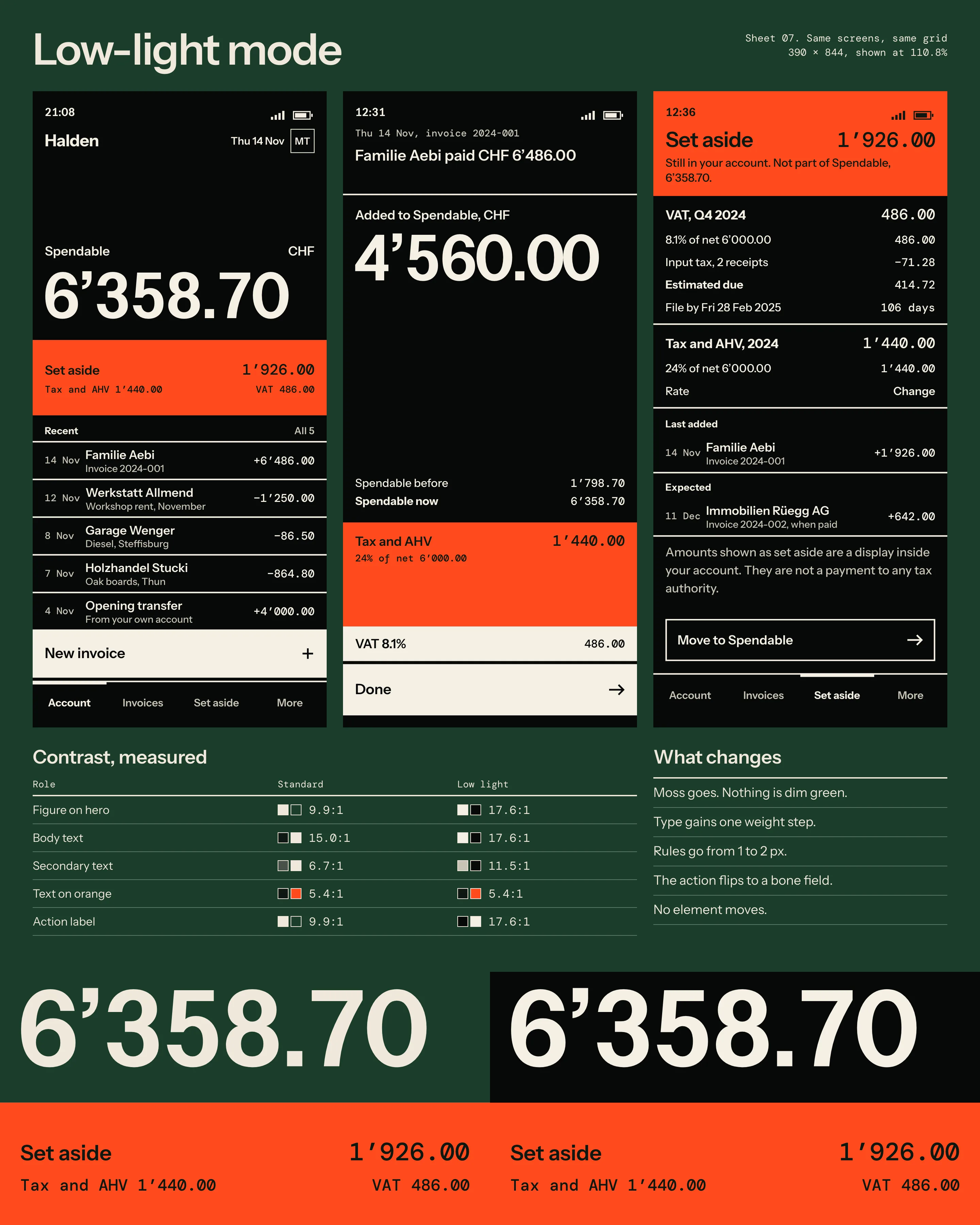
Orange means one thing in the kit: money or input that needs a second look. Ink on orange measures 5.4:1, and orange on bone only 2.8:1, so it is always a field and never text.
My first low-light version kept the moss green, and it went muddy on a dim screen in a stairwell. Moss is gone in that mode. Text gains a weight step, rules go from 1 to 2 px, and no element moves. I also dropped switching by light sensor, because it flipped back and forth on a site with moving shade. It is a setting now.
Result
In the second round of testing, 9 of 10 sole traders named their spendable amount within 5 seconds. On the prototype it was 3 of 10. Contacts to support about tax money fell 41% in the first three months. No legal string was shortened in any language, and the app needed no layout exception at 360 px.
One thing I would change: Move to Spendable is still too easy to reach. People use it in the last week of a bad month, and the second confirmation does not slow them much. I would show the VAT date on that confirmation.
- 9 of 10
- Named their spendable amount in 5 seconds, up from 3 of 10
- 41%
- Fewer support contacts about tax money in three months
- 0
- Legal strings shortened across four languages
- 360 px
- Narrowest phone tested, with no layout exception
Credits
- Design
- Ines Keller
- Engineering lead
- Jonas Imhof
- Compliance
- Aurelia Bezzola
- Translation, DE FR IT
- Chiara Monti
- User research
- Thea Lüthi
- Accessibility review
- Marc Rochat