Annual report
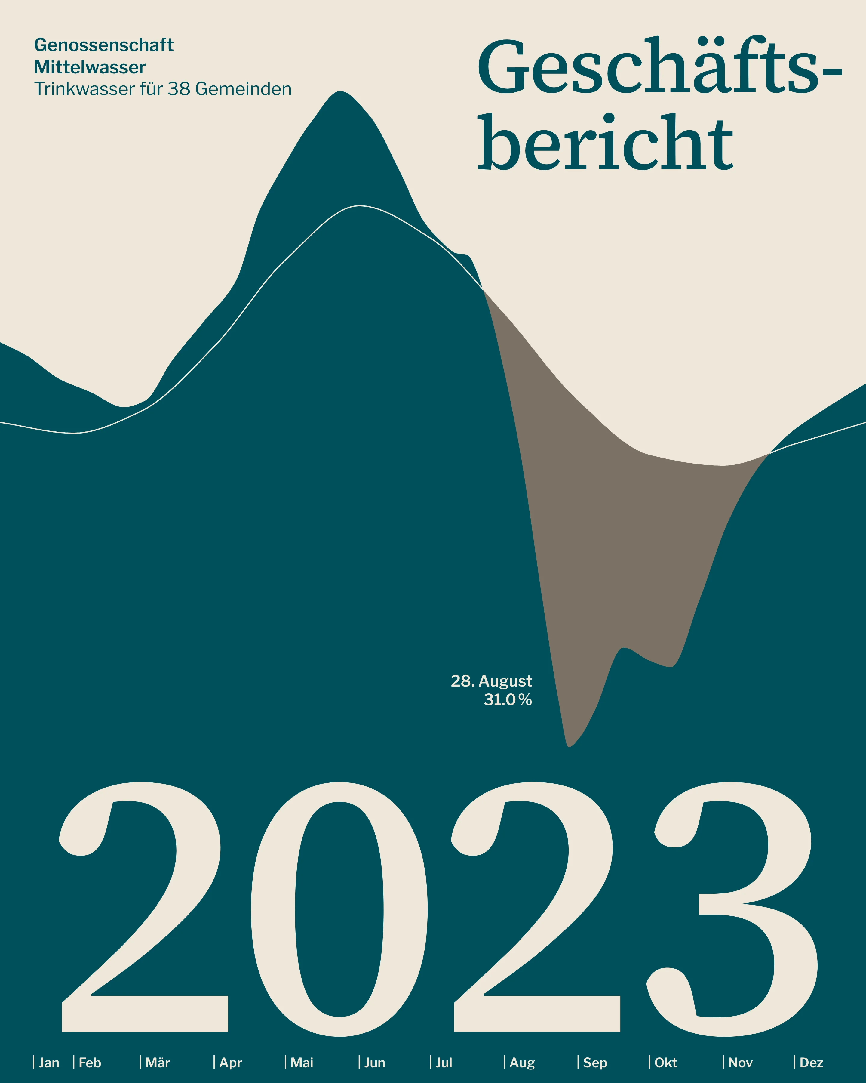
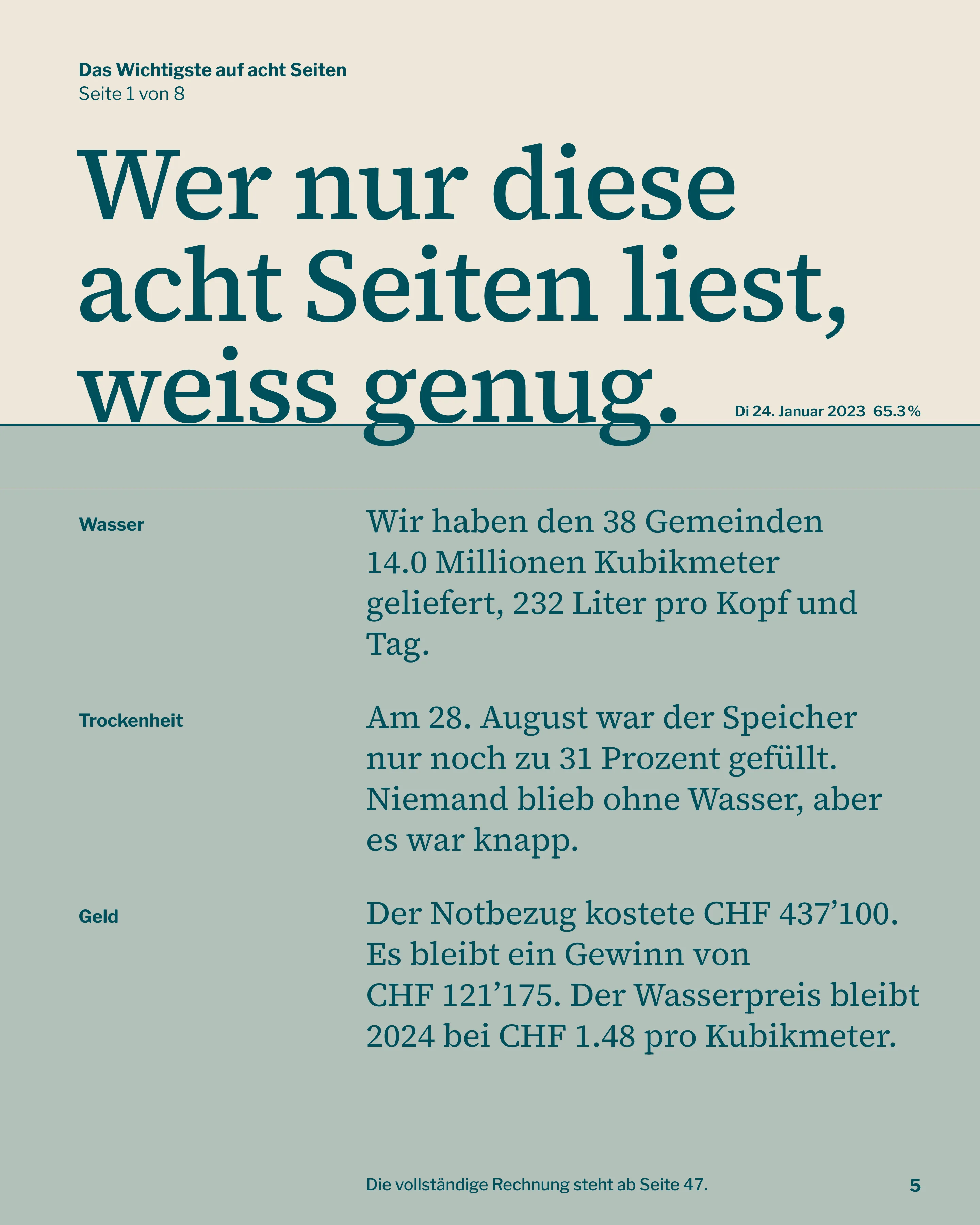
A 64-page annual report for a water cooperative. A line on every spread stands at the reservoir's level for that date; riffle it and the 2023 drought appears.
Brief
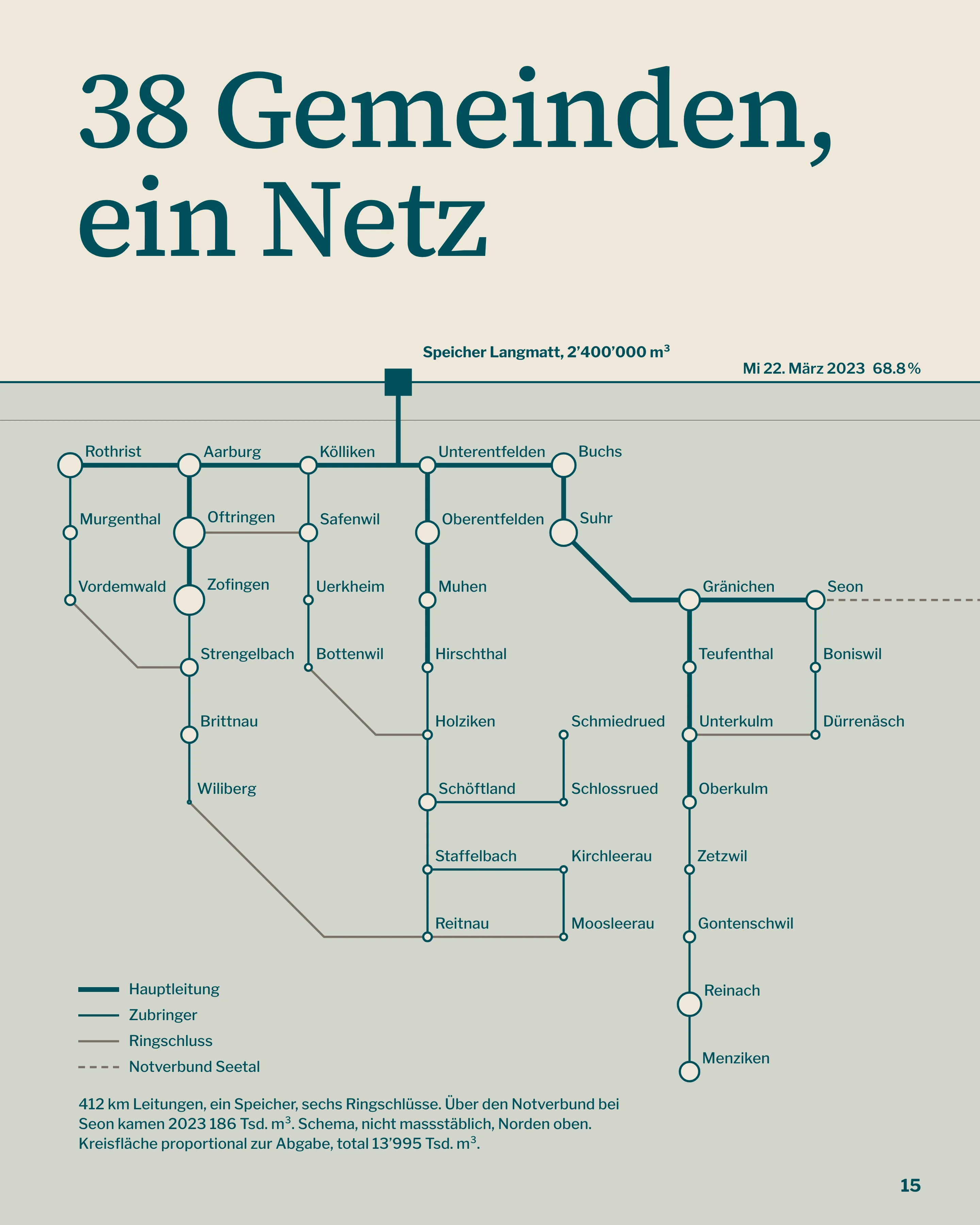
Genossenschaft Mittelwasser supplies drinking water to 38 municipalities in the Aargau and is owned by its members. Its previous annual report ran to 96 glossy pages and, by the board's own admission, nobody finished it. They asked for something shorter that would still satisfy the auditors. The report is in German; 2023 happened to contain the lowest reservoir level since measurements began in 1976.
So the year had a shape worth showing, and the report could carry it without a single extra page.
Constraint
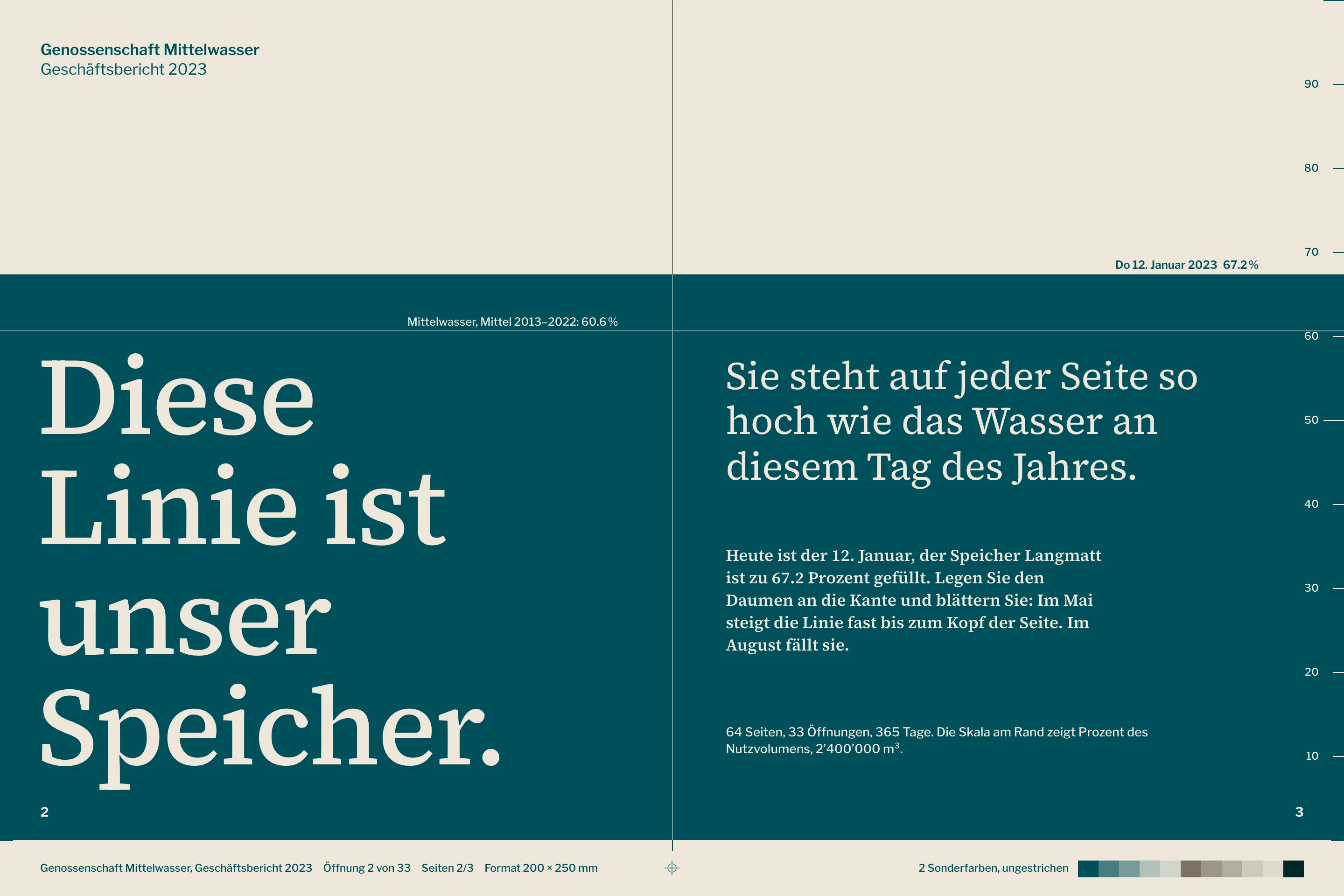
The full statutory accounts had to stay in: balance sheet, income statement, cash flow, notes, auditor's report. Most members who read the report are over 60. It had to print on uncoated recycled stock in two spot colours, a condition from the cooperative's own procurement rules, and no photograph survives that combination well.
The page format is 200 × 250 mm. Running text could not go below 12.5 pt, figures not below 9.7 pt.
Decisions
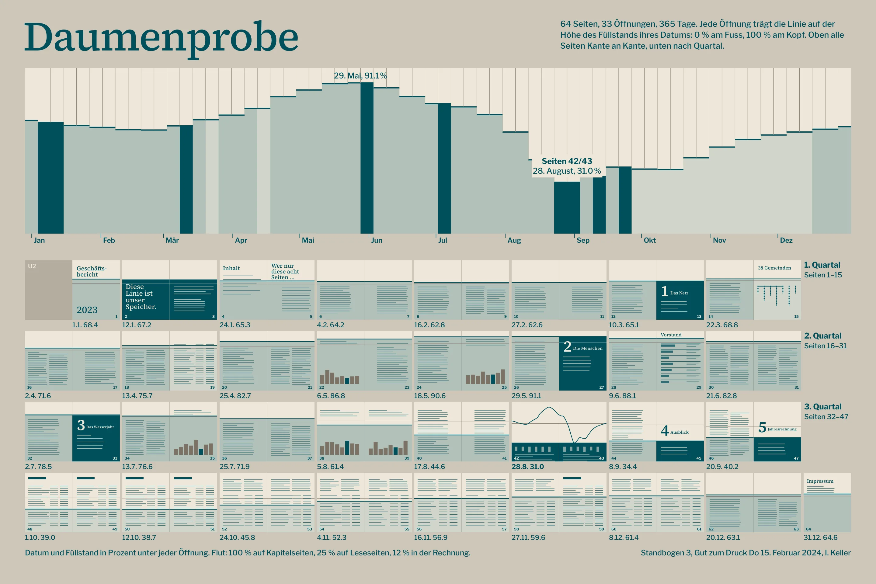
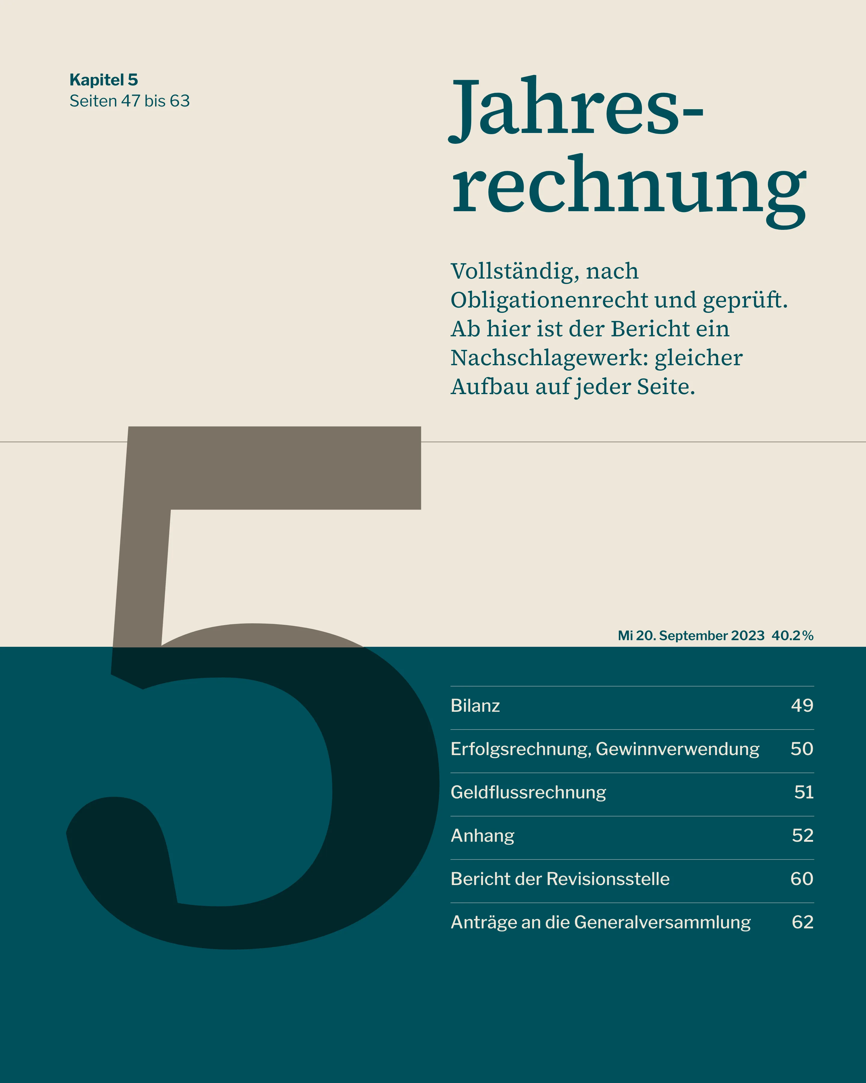
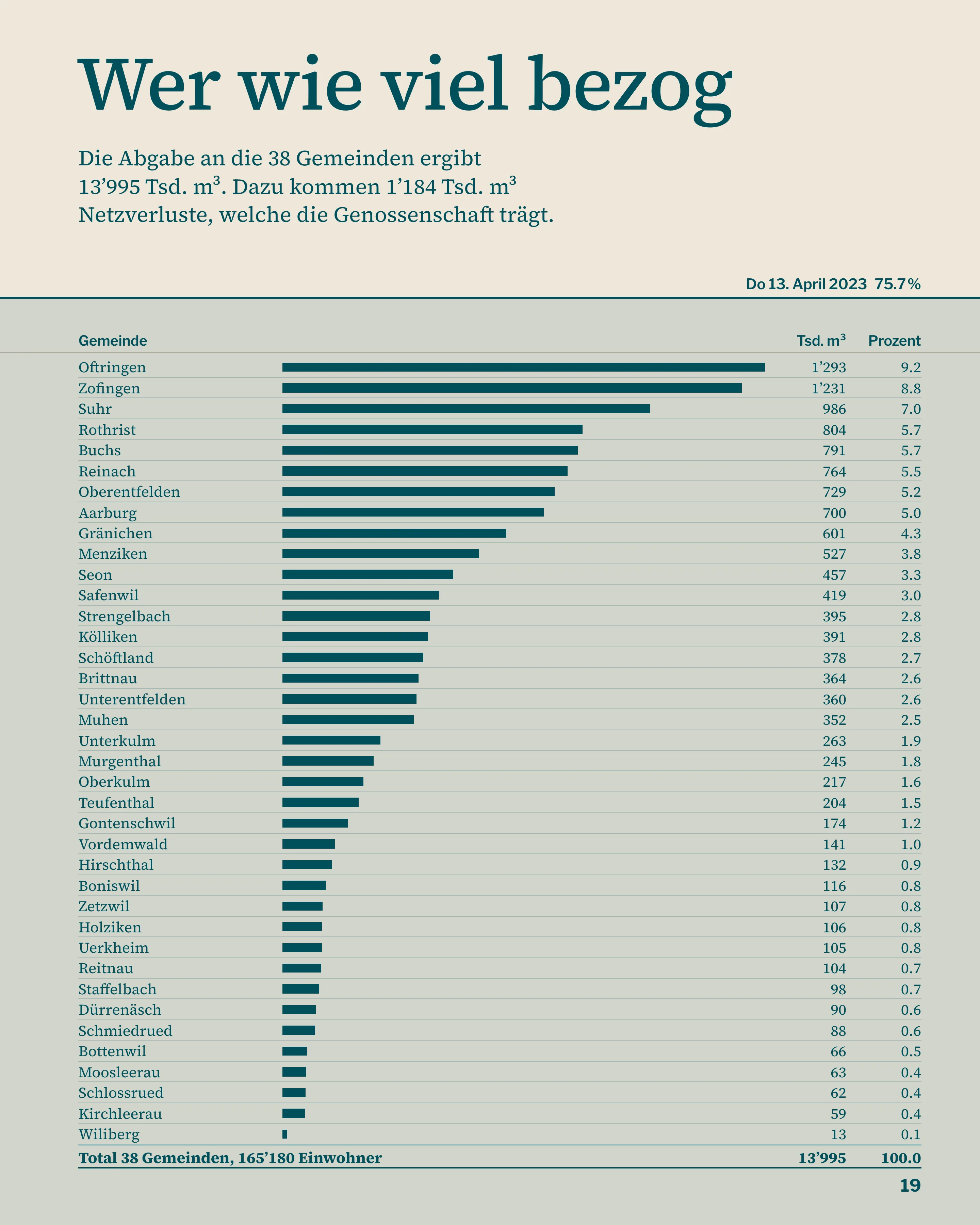
Each of the 33 openings is pinned to a date, spaced evenly through the year, and takes that day's level: 0 % at the foot of the page, 100 % at the head. The line stays flat across a spread. I first tried letting it slope from one date to the next, which was more accurate and made every column of text look crooked.
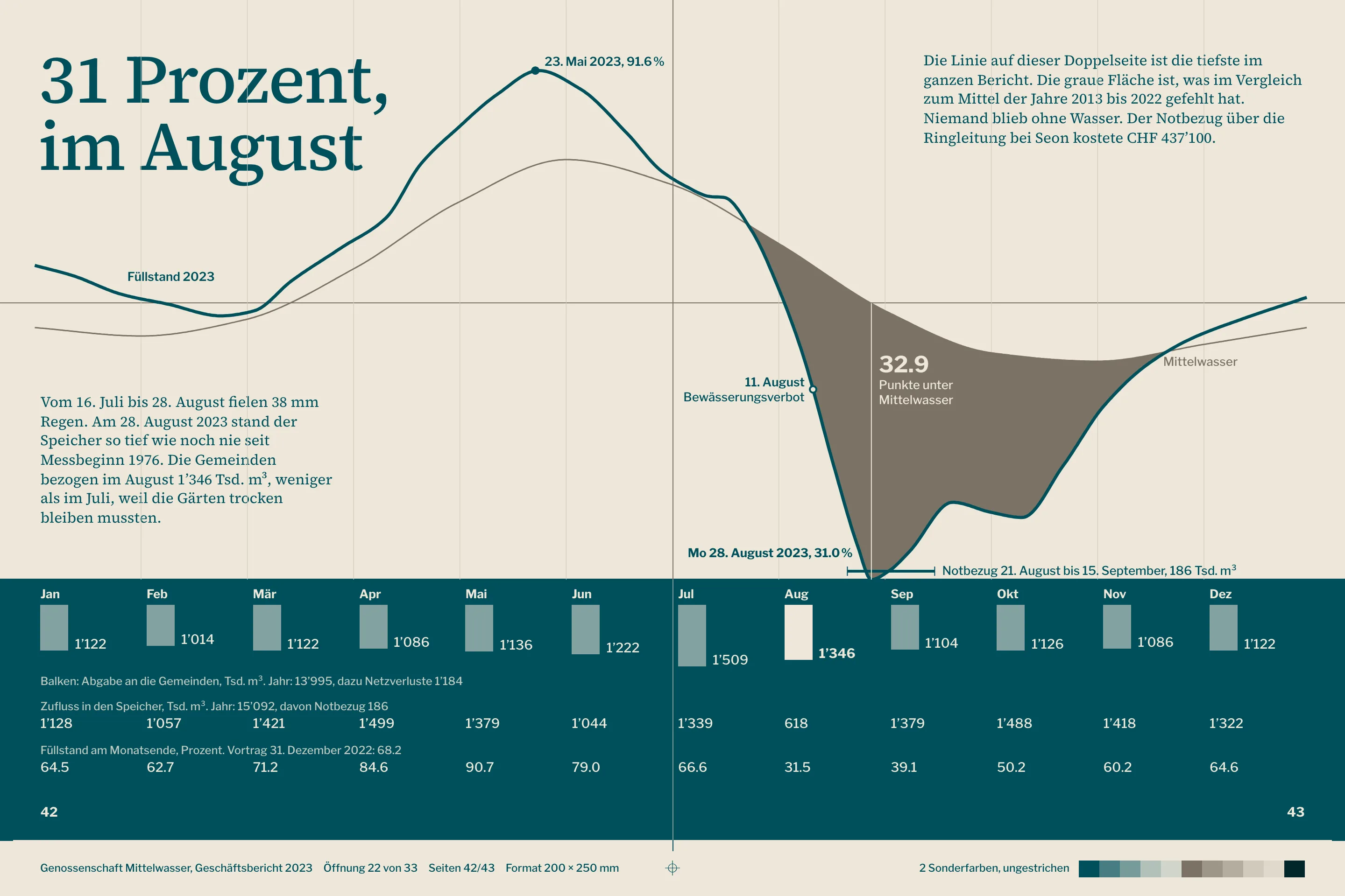
The content then had to follow the calendar, not the other way round. The drought chapter was moved until its data spread landed on pages 42/43, the opening pinned to 28 August. That pushed the accounts into the autumn pages, where the line is low and leaves room for tables.
Two inks
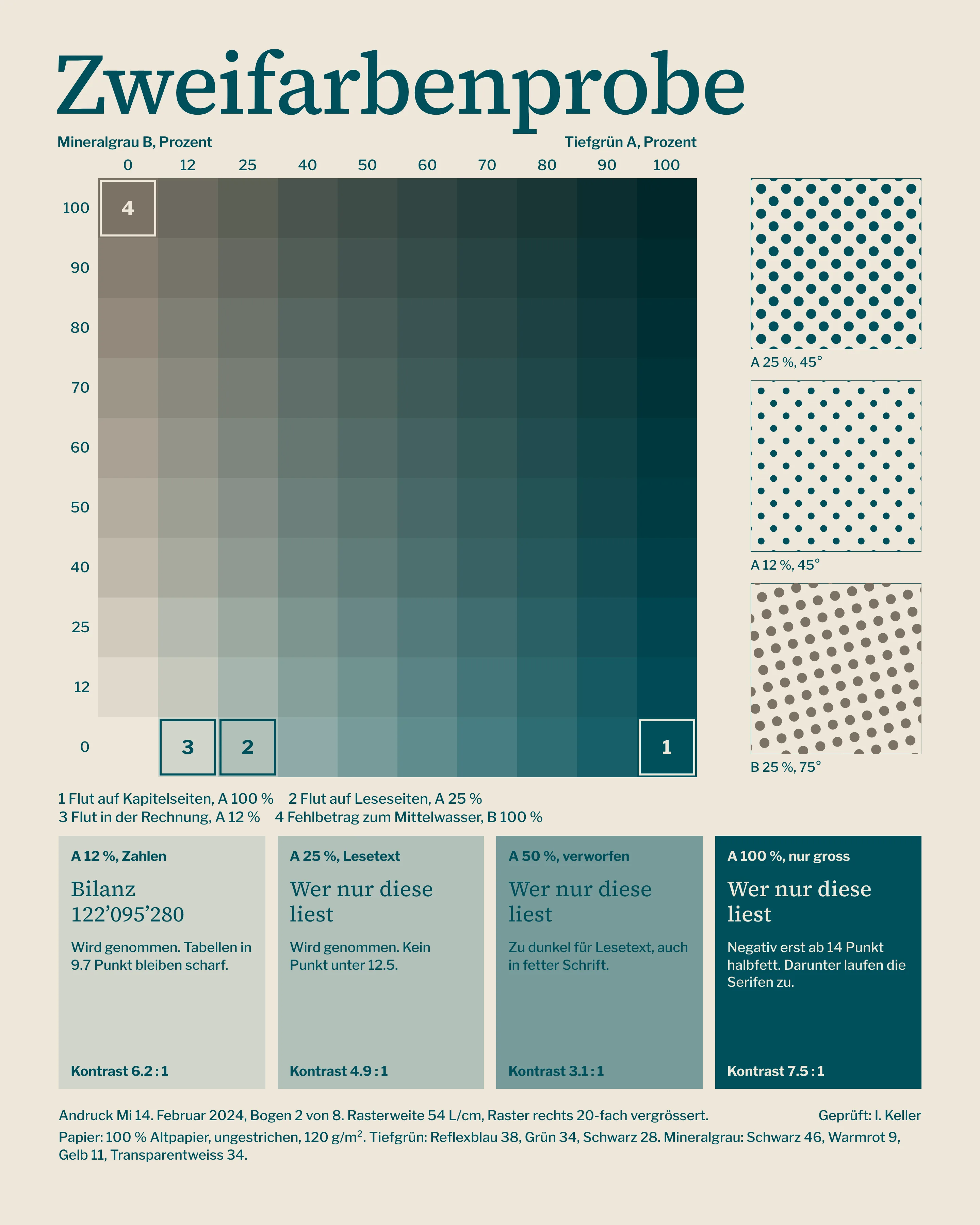
I rejected any chart that needed a legend. With a blue-green and a mineral grey there are not enough distinct series, and tints that look separate on a monitor merge on recycled paper. Every chart has one solid line, one grey area for what is missing, and labels placed directly on the marks.
The press test settled the flood. Solid ink below the line swallowed 12.5 pt serif text, and 50 % was too dark to read on. So the flood runs at three strengths: 100 % on chapter openers, 25 % on reading pages, 12 % in the accounts. Reversed serif text starts at 14 pt semi-bold.
“At the assembly a member of 84 showed me with her thumb where the water stood in August. In ten years nobody had ever quoted the annual report back to me.”
Accounts
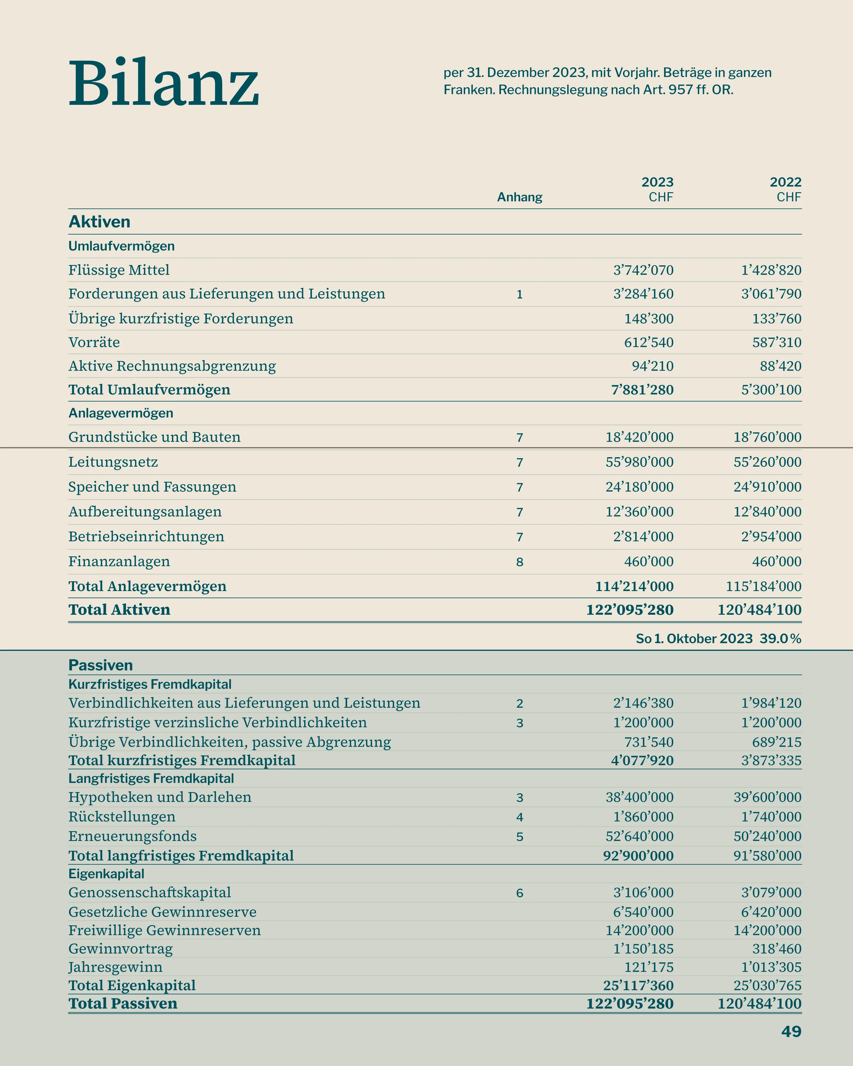
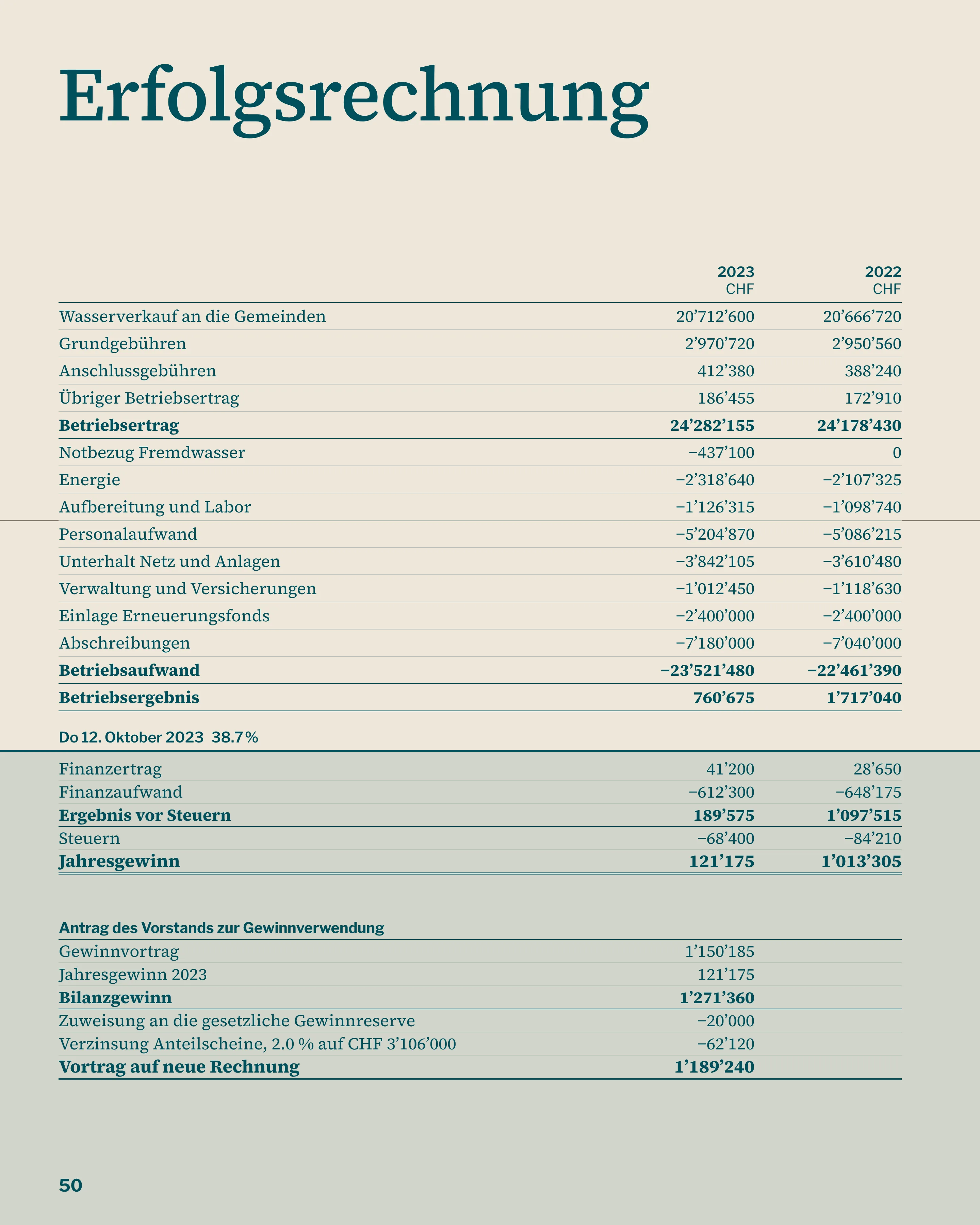
The accounts are a reference section, and treating them as one cut the most pages. Same table on every page, prior year alongside, no commentary. A separate booklet was the obvious alternative. The auditors wanted a single document and it added a second item to the mailing, so I dropped it.
Rows are set so that the water line falls in a break between them and never strikes through a figure. On the balance sheet it divides assets from liabilities, which was luck with the date of 1 October, and I kept it.

- 64
- pages, down from 96
- 8
- page summary, read in full by 71 % of members surveyed
- 216 g
- per copy, down from 486 g
- 340
- members at the assembly, up from 212
Result
The cooperative surveyed 412 members after the 2024 assembly. 71 % had read all eight summary pages, against 19 % who said they had finished the previous report. The lighter paper and shorter extent brought each copy from 486 g to 216 g, which moved the mailing down a postage band.
One thing did not work. A riffled report shows the hydrograph best when the book is new; once the spine is broken, it falls open at the accounts. So next year's edition prints the riffle sheet as a fold-in.
Credits
- Design
- Ines Keller
- Text and editing
- Lukas Frei
- Accounts typesetting
- Nora Bächtold
- Proofreading
- Anita Rohner
- Print supervision
- Reto Amsler