Concert hall identity
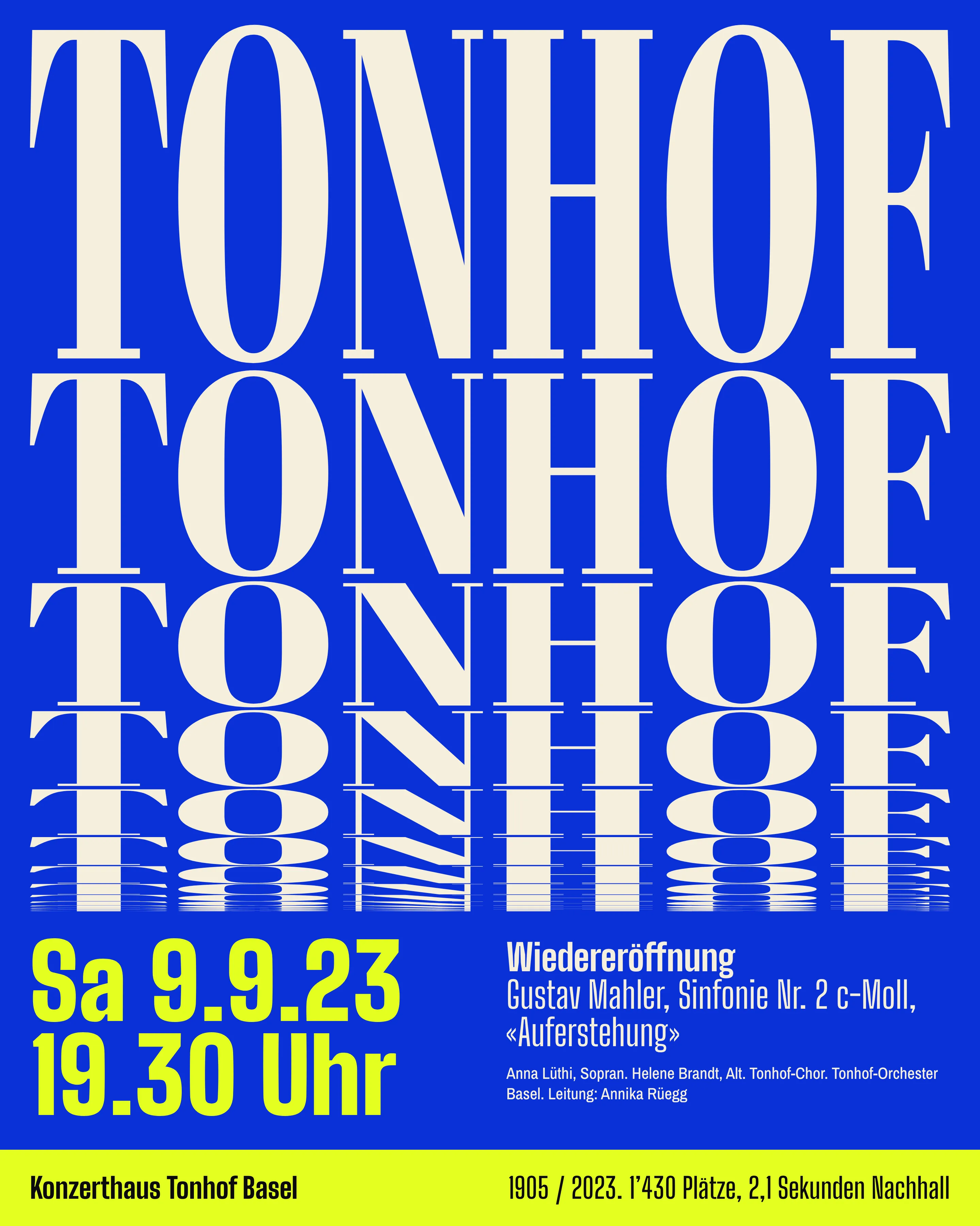
Identity and poster system for a 1,430-seat hall in Basel, generated from its measured 2.1-second reverberation. 96 posters, about 52 minutes each.
Brief
Konzerthaus Tonhof is a shoebox hall from 1905 in Basel with 1,430 seats. It closed for 18 months and reopened for the 2023/24 season. The director, Regula Stähelin, wanted one identity for the reopening and the ten seasons after it, and she wanted a younger audience without losing the people who already pay for the building.
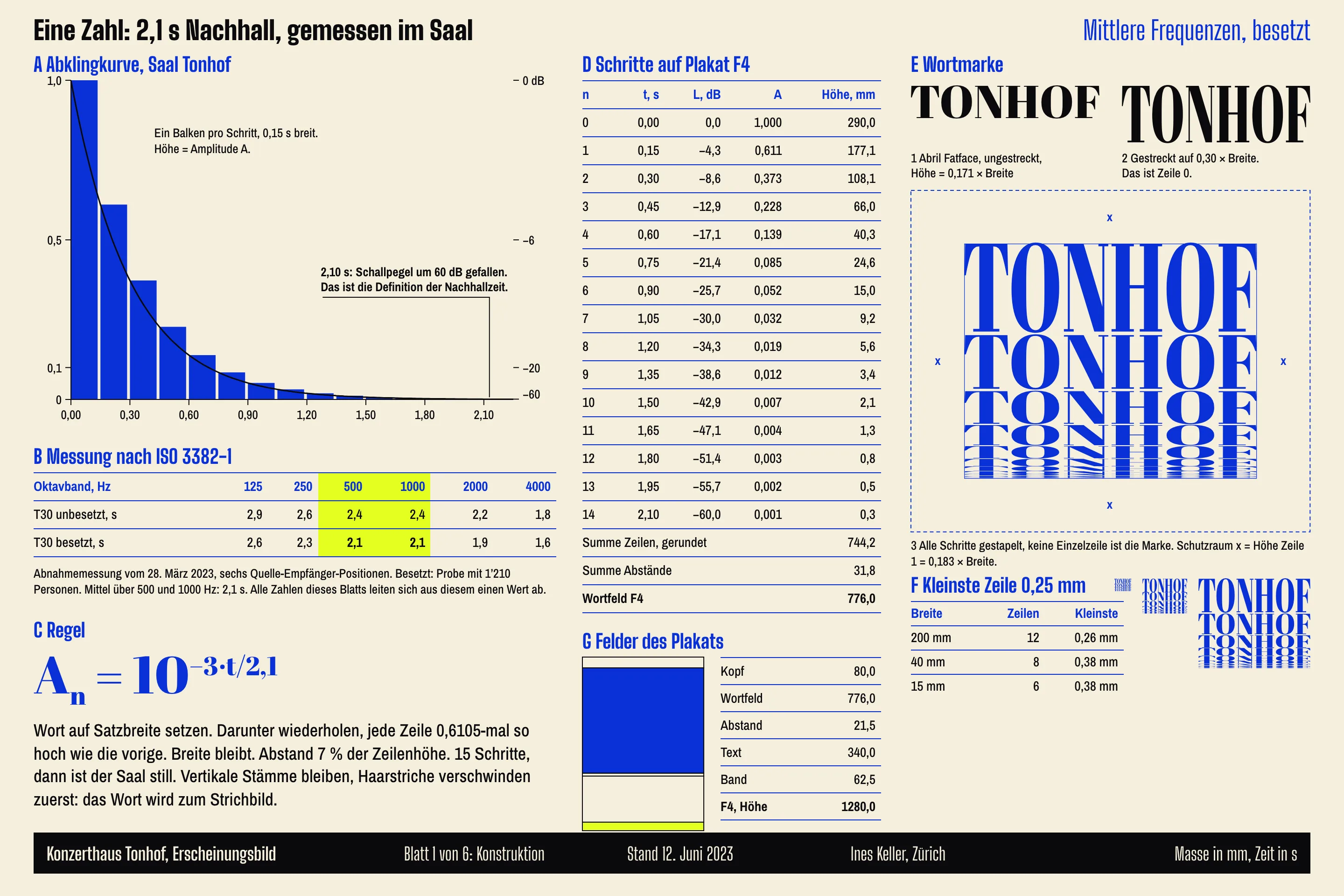
The old identity was a lyre in a crest. An agency drew 14 posters a season at CHF 2’800 each, so most concerts had none. I asked to see the acoustician’s acceptance report before I drew anything. It gave one number that nobody else in the city can use: 2.1 seconds of reverberation at mid frequencies, with an audience in the room.
Constraint
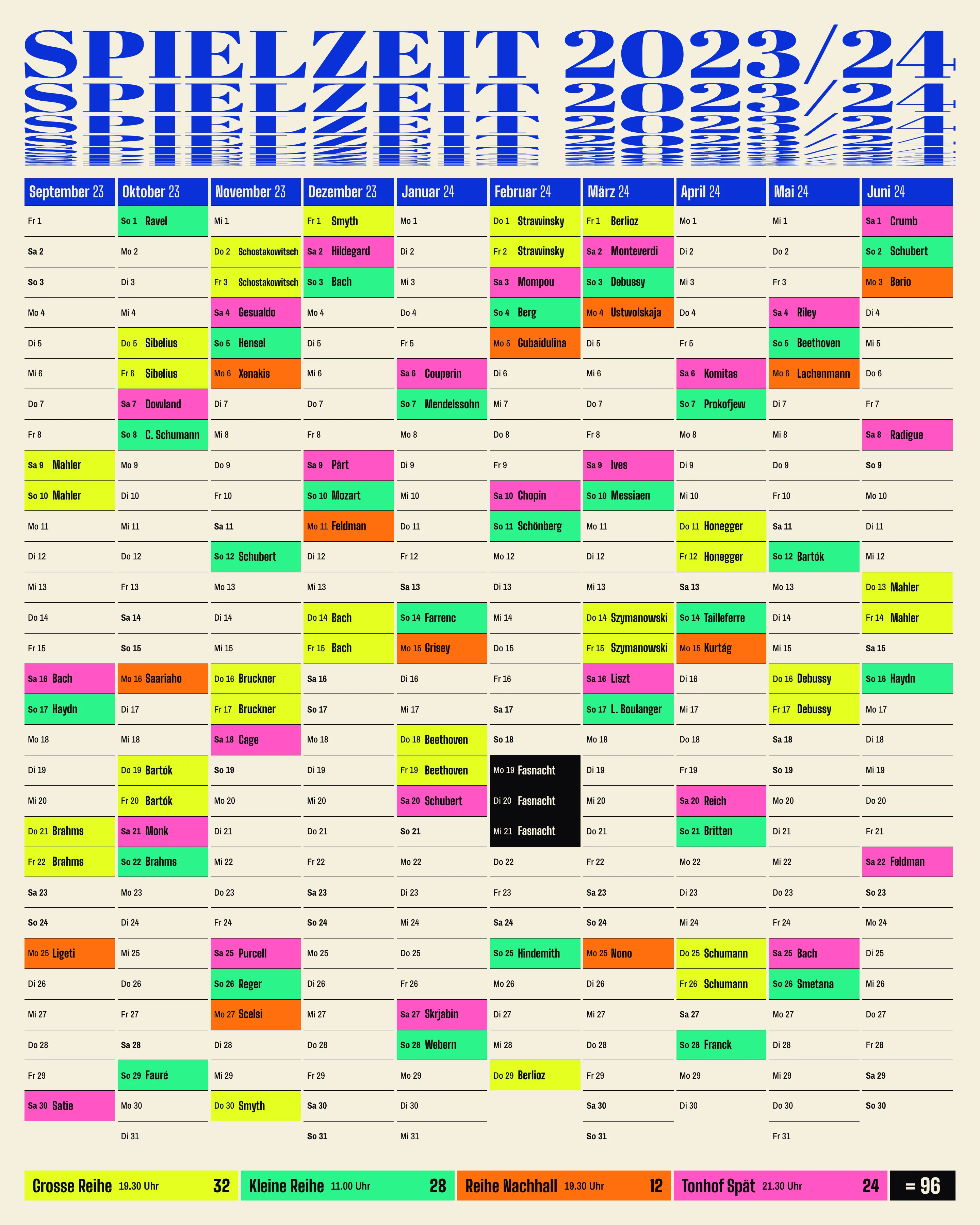
96 concerts a season need 96 posters, and after handover the hall has two people to make them, neither of them a designer. I set the limit at one hour per poster, proofreading included.
The content works against that. A season holds SCHOSTAKOWITSCH at 15 letters and BERG at four, and titles like Musik für Saiteninstrumente, Schlagzeug und Celesta. A system that depends on a designer choosing type sizes fails on the first long name.
The audience was the other limit. The average subscriber was 67, under-35s bought 11 % of tickets, and subscribers cover about a third of the hall’s ticket income. Anything that looked like a farewell to them would have cost more than it brought in.
Decisions
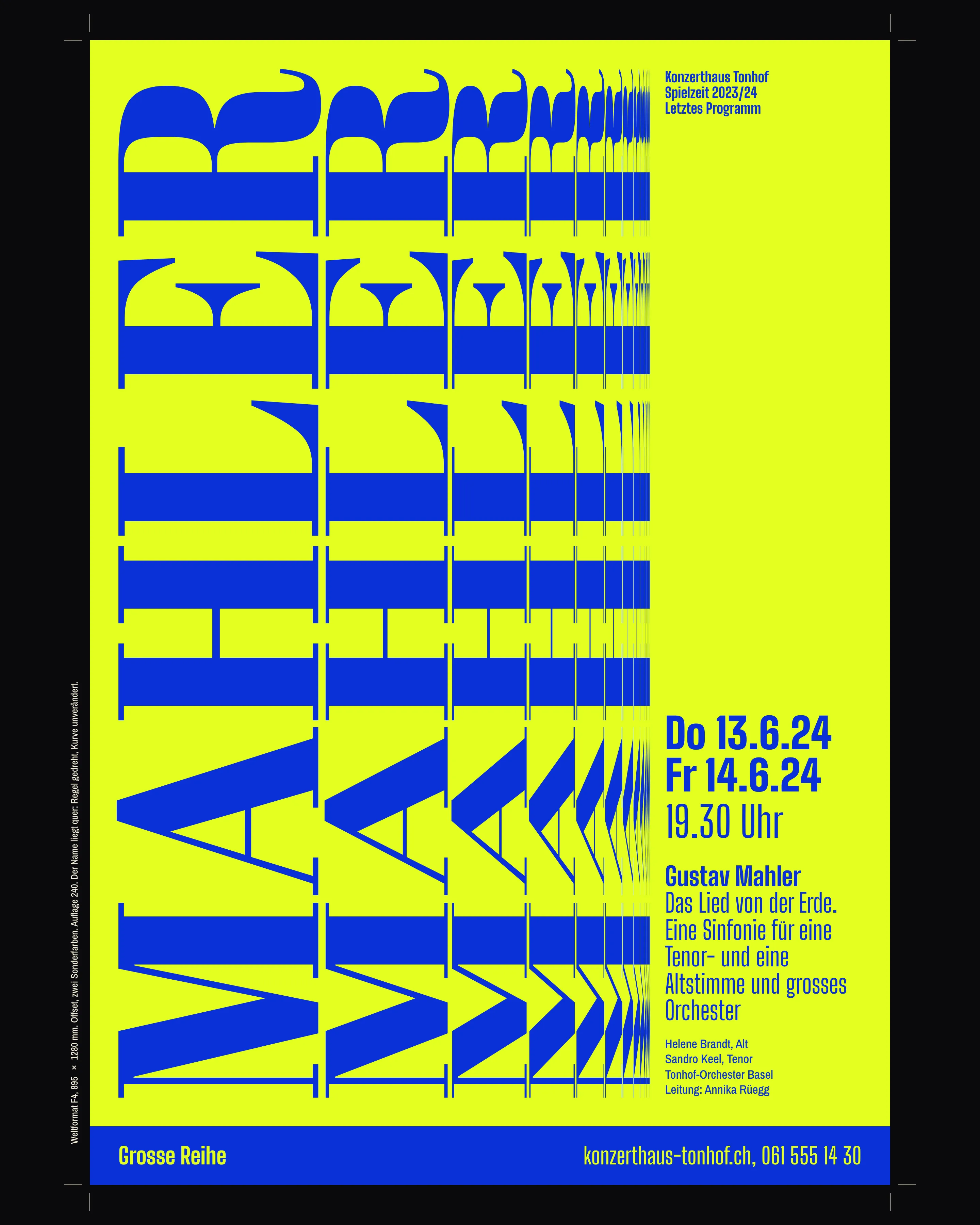
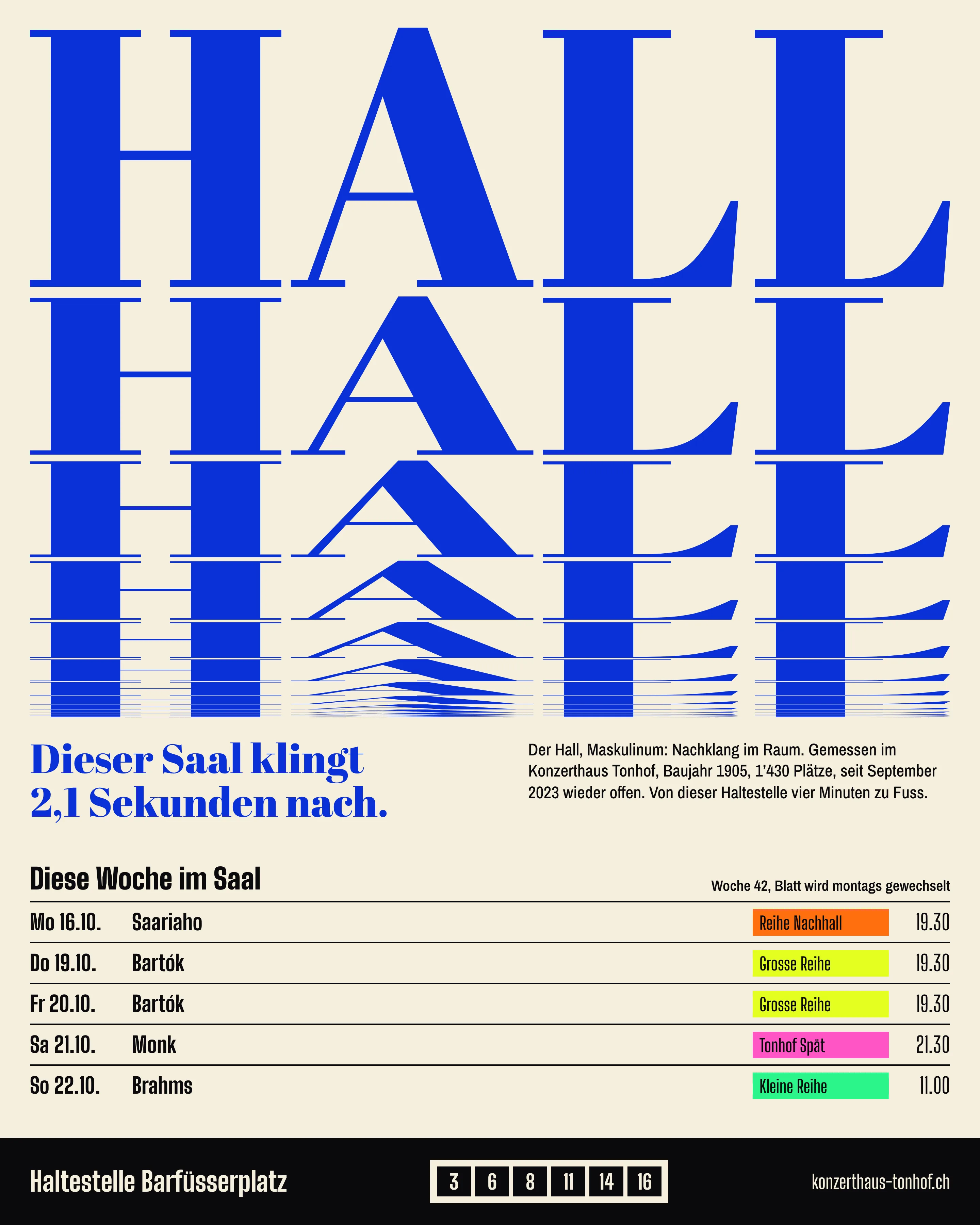
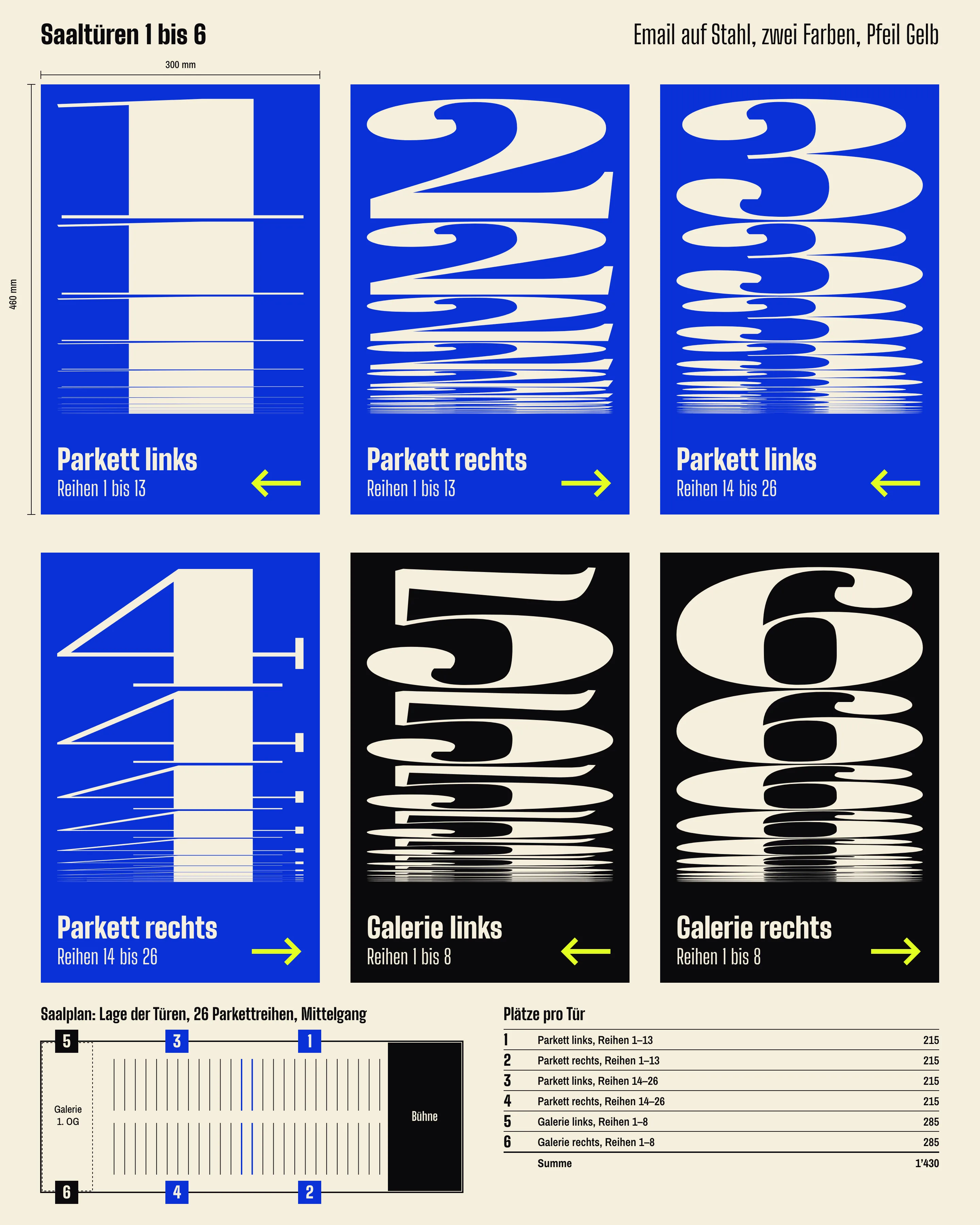
The rule is the physics, unedited. Reverberation time is how long a sound takes to fall by 60 dB, so amplitude follows A = 10^(−3t/2.1). Sampled every 0.15 s, each step is 0.6105 times the one before, and step 14 lands on 2.10 s. The poster sets the composer’s surname to the full width, then repeats it 14 times below, each line 0.6105 times as high. Width never changes, so a long name gets narrower letters, not a smaller size. BERG and SCHOSTAKOWITSCH fill the same field.
I tried Bodoni Moda and Gloock first. Both were too even: their stems thinned along with everything else. Abril Fatface has very fat stems and very thin hairlines, and vertical squeezing removes the hairlines first. By about step 8 the name has turned into bars, which is the closest thing to a dying sound I could get from a typeface. Programme text is in Big Shoulders Display, which holds long German titles in two fixed columns without any size decisions.
I rejected two other versions. In one, the letters themselves got narrower from T to F. It looked good at poster size and could not be read under 40 mm wide, and it had no way to take 15 letters. In the other, I plotted decibels instead of amplitude, which is a straight line and has no curve to show.
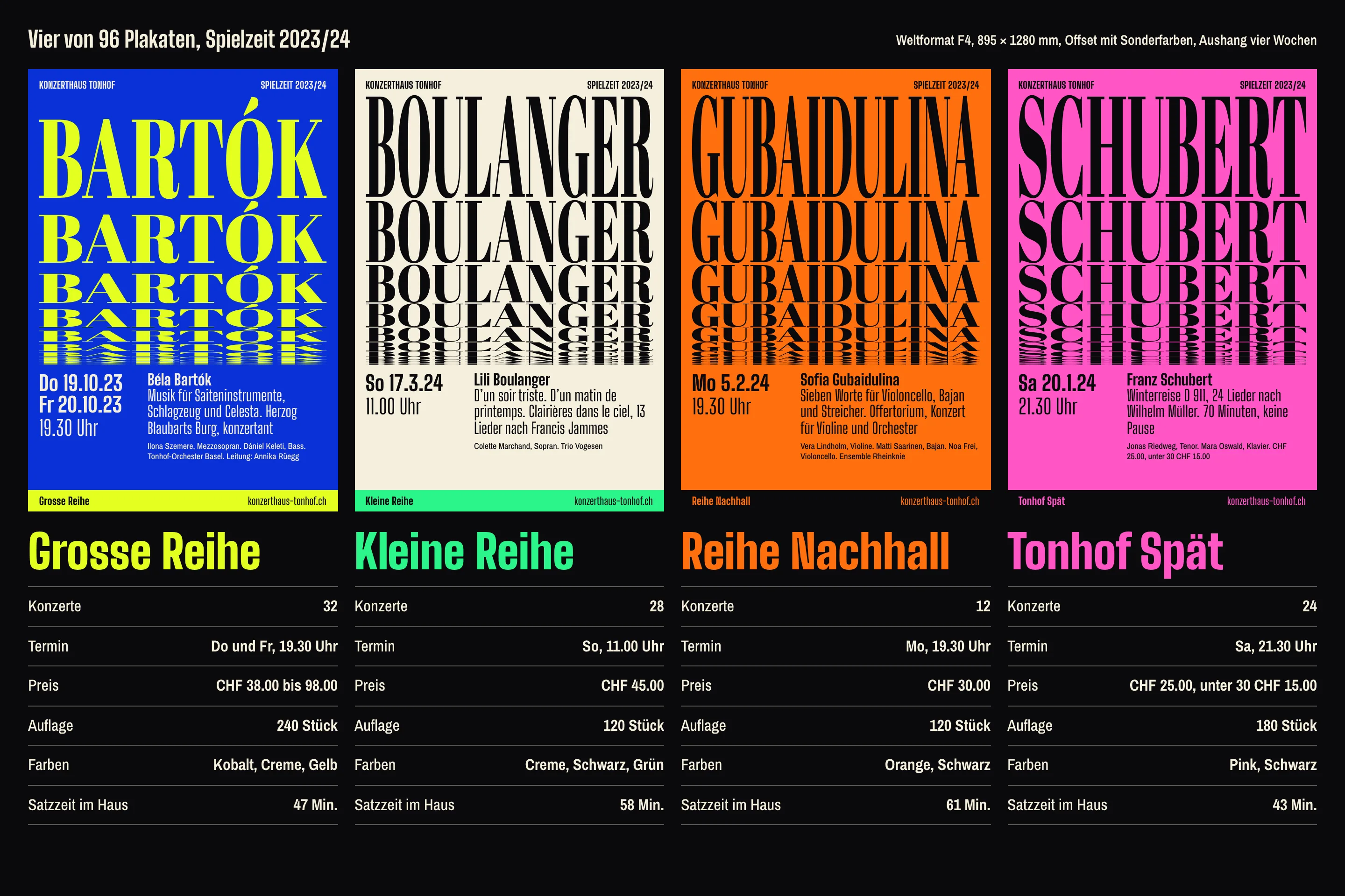
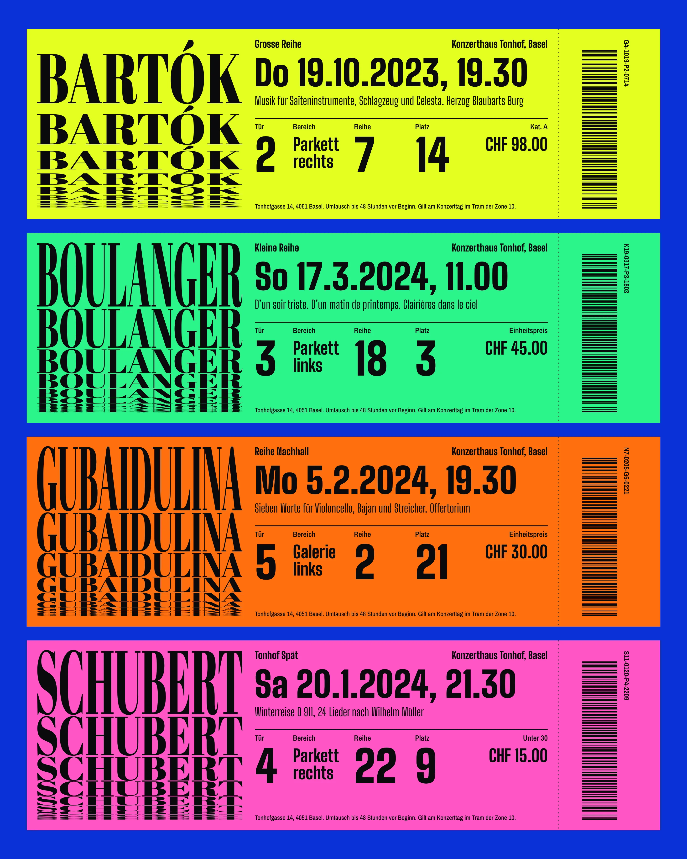
Colour is three constants and one acid per series: yellow for Grosse Reihe, green for Kleine Reihe, orange for Reihe Nachhall, pink for Tonhof Spät. Staff choose the series from a list and the colours follow. Orange vibrates badly on cobalt, so that series takes orange as the field. Red was out from the start because every other hall in the region uses it.
Motion
The film runs on foyer screens and on the hall’s site, and it is silent on purpose. A hall that sells its acoustics should not demonstrate them through a phone speaker. The opening fall takes the real 2.1 seconds, and it is faster than people expect: half a second in, the word is already at minus 14 dB. Nothing eases and nothing fades. The steps cut, as the stack does on paper.
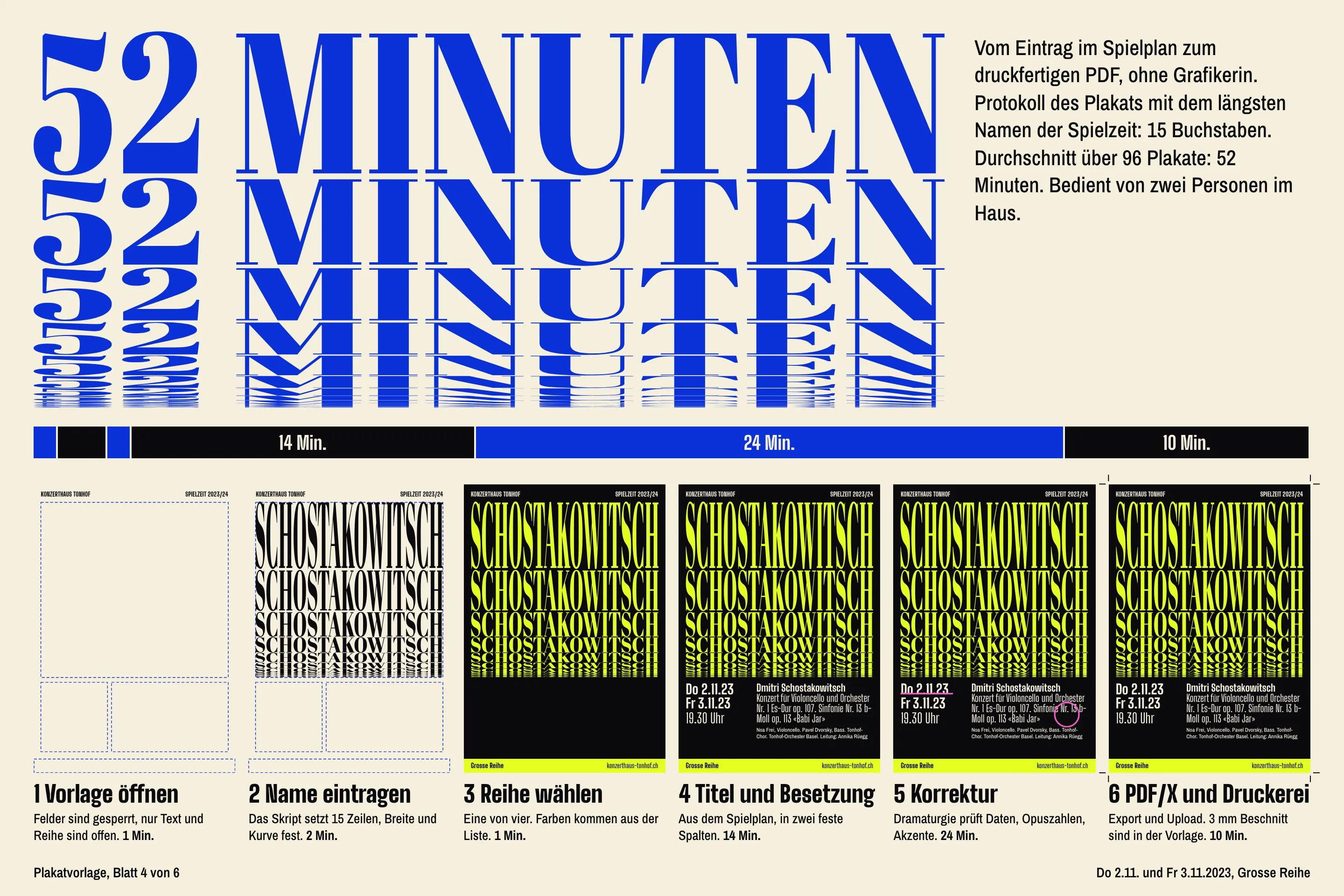
One hour
The template is a locked layout file with one script. Staff type the surname, pick a series and paste text from the season plan. The script draws the 15 lines. There are no type sizes to change, because the fields don’t allow it. I watched the first ten being made and moved the date field twice, then stopped.
Almost half the 52 minutes is the dramaturge checking opus numbers and accents. I left that alone. It is the one step that should be slow.
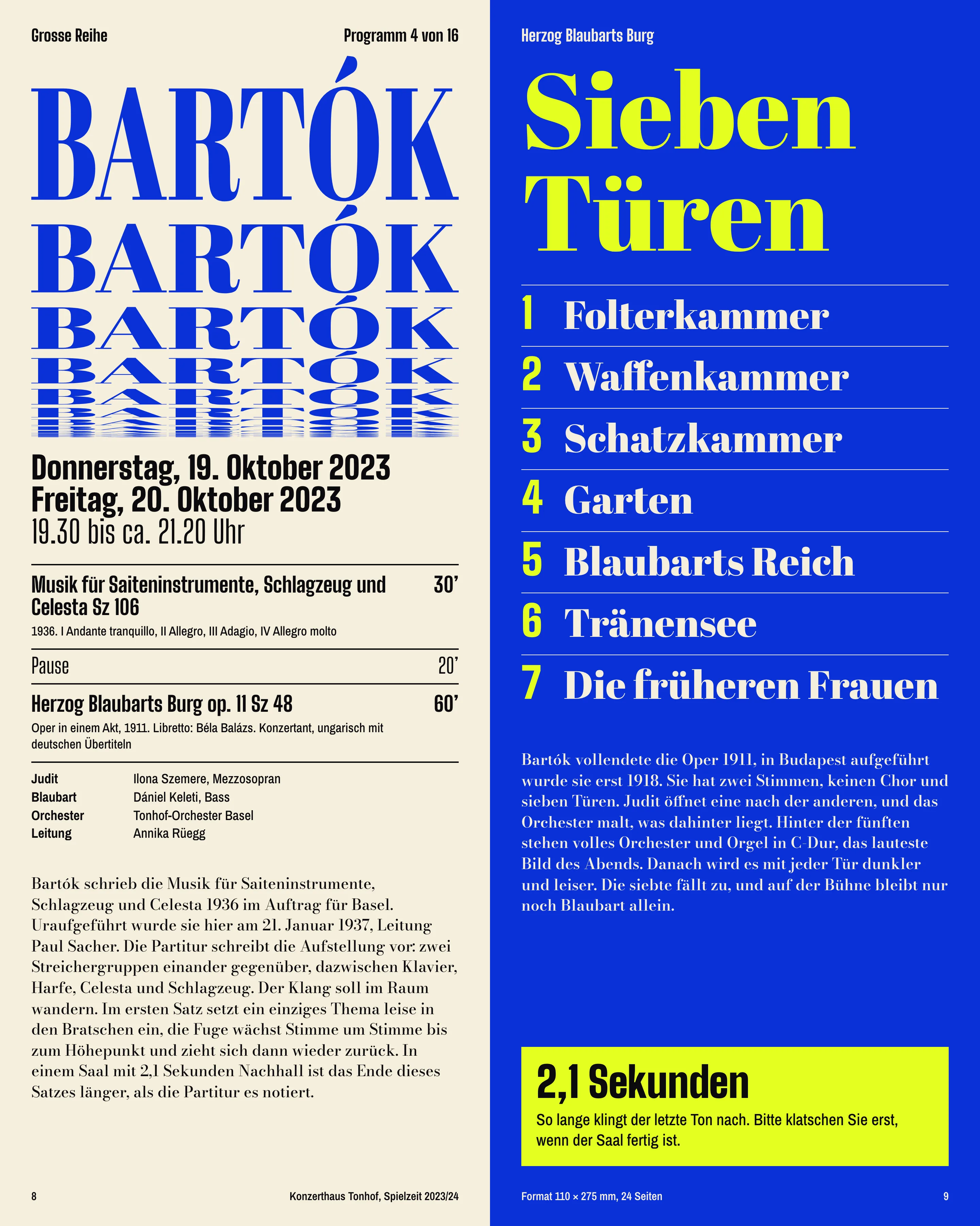
The booklet is 110 mm wide because it fits a jacket pocket and because the rule likes height. On each page the small print does the unglamorous job: when the concert ends, how long the pause is, which door. The yellow box asks people to wait 2.1 seconds before clapping. The hall’s dramaturge wrote the first version of that line, as a joke, and it stayed.
Subscribers
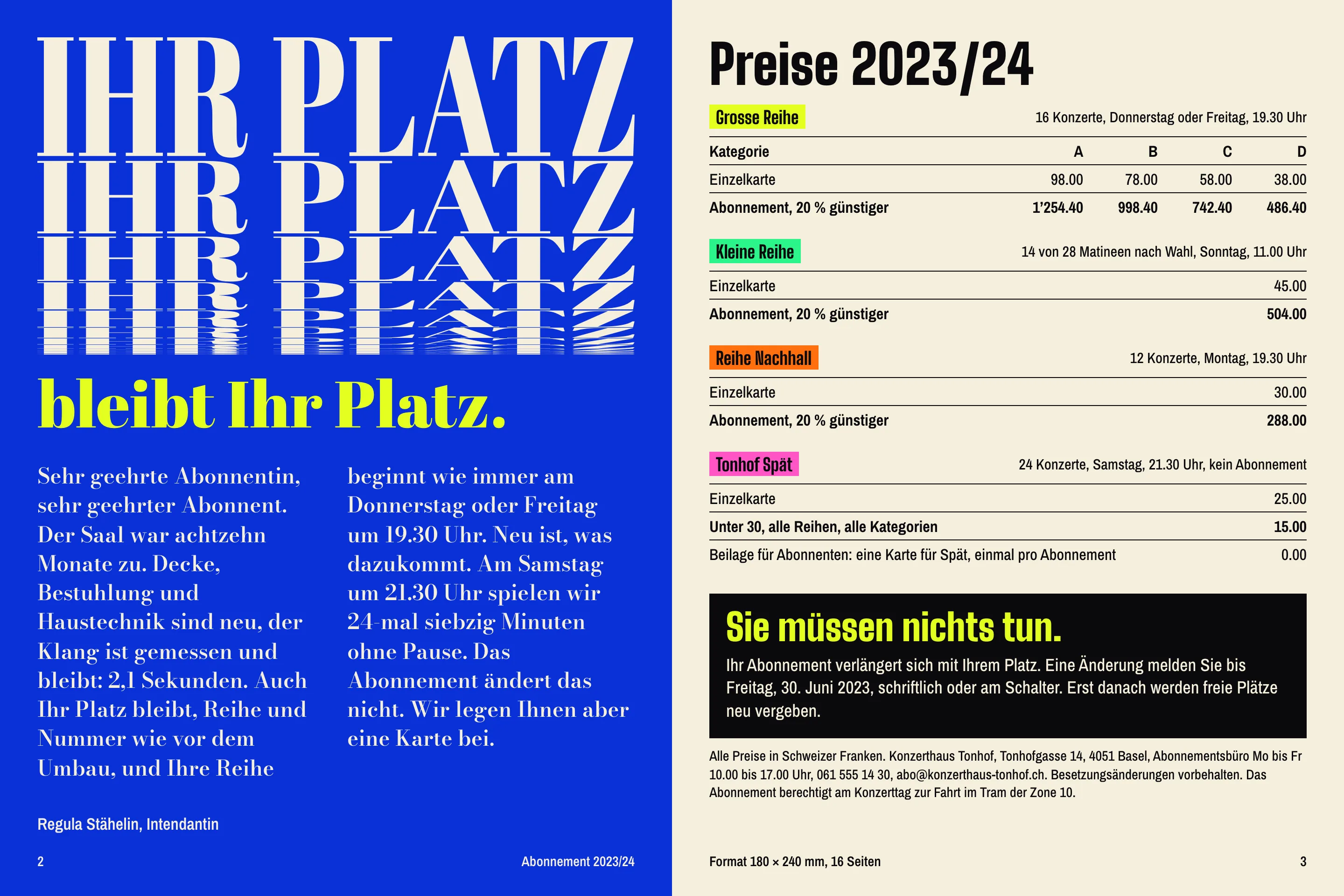
The new look is loud, and I expected the subscribers to mind. So the brochure says almost nothing about design. The headline means “your seat stays your seat”, and the black box means “you don’t have to do anything”. Renewal is automatic, seats keep their row and number, and the Thursday and Friday series begin at 19.30 as before.
The younger audience gets a separate way in rather than a changed main programme: Tonhof Spät, 24 Saturdays at 21.30, about 70 minutes with no interval, CHF 25.00, or CHF 15.00 under 30. Subscribers receive one free card for it, which was Regula’s idea and worked better than anything I drew.
“I expected to defend the pink to the subscribers’ committee. Nobody asked about the pink. They asked whether their seat had moved. It had not.”
- 96
- posters in the season, up from 14
- 52 min
- average to set one poster, in-house
- 94 %
- subscribers who renewed
- 24 %
- tickets bought by under-35s, up from 11 %
Result
The hall set all 96 posters itself. The times ran from 43 to 61 minutes, so a few missed my one-hour limit, by not much. The agency budget of CHF 39’200 a year now pays for printing.
Renewal came in at 94 %. Under-35s went from 11 % to 24 % of tickets, nearly all of the increase through Tonhof Spät, so I can’t claim the posters did it alone. What I can say is that nobody at the hall has asked me for a poster since the handover, and that was the actual job.
Credits
- Design
- Ines Keller
- Acoustic measurement
- Thomas Imhof
- Dramaturgy and programme texts
- Lea Wyss
- In-house poster production
- Sabine Frey
- Template script and film frames
- Mirko Bächli
- Printing
- Druckerei Birsfelden