Logistics design system
One design system for a Swiss freight forwarder: 60 legacy screens, four teams, gloves, 1-bit labels, 40 rows on one screen, and no rewrite allowed.
Brief
Kessel Freight runs pallet networks between Basel, Milan and Rotterdam. Four teams maintain dispatch software, warehouse handhelds, a customer portal and label printing. Together that was 60 screens, three button styles and no shared word for a held consignment: dispatch said "gesperrt", the portal said "on hold", and the handhelds showed a red row.
I was asked for a design system. The actual request was that a dispatcher, a forklift driver and a customer should be able to talk about the same pallet.
Constraint
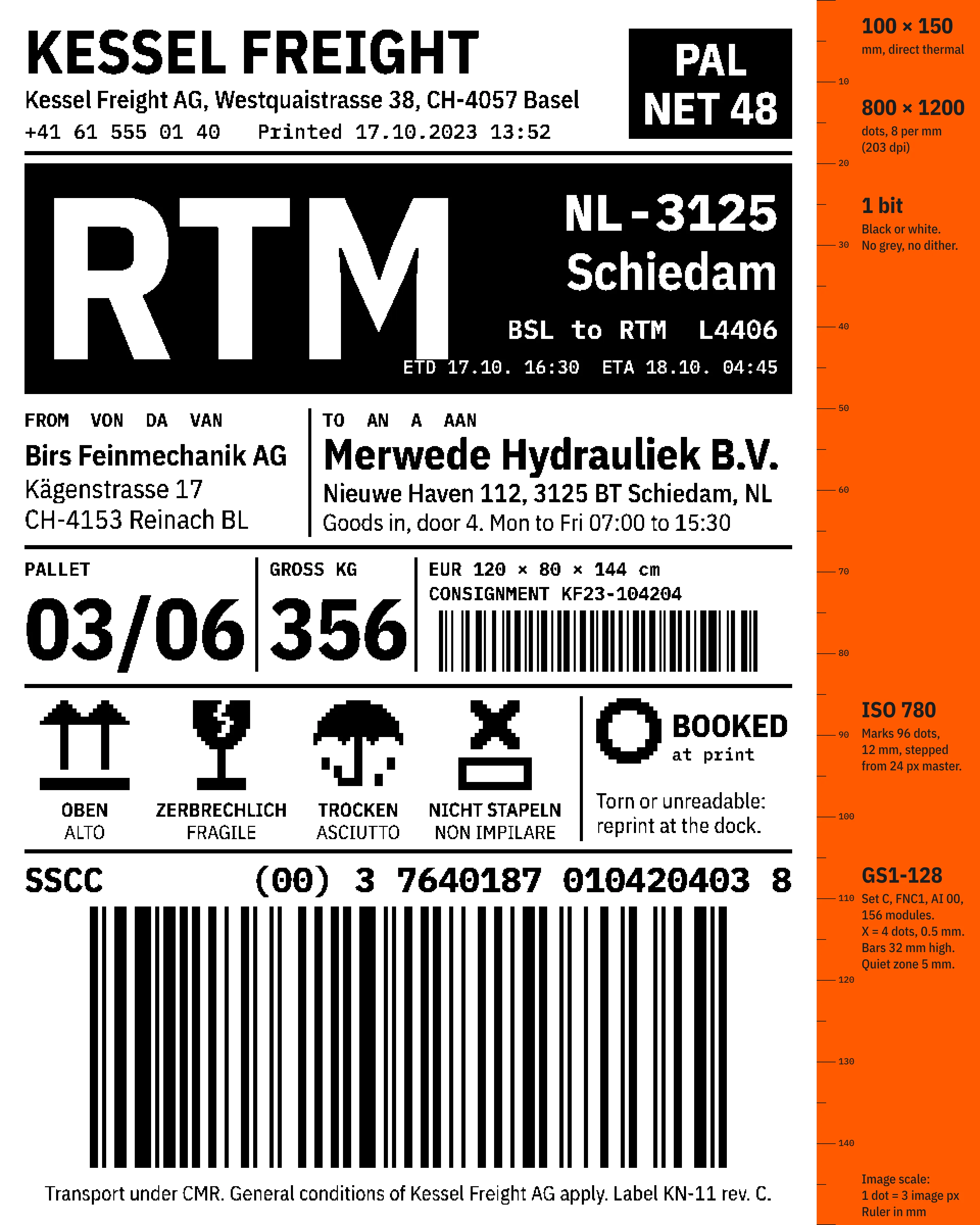
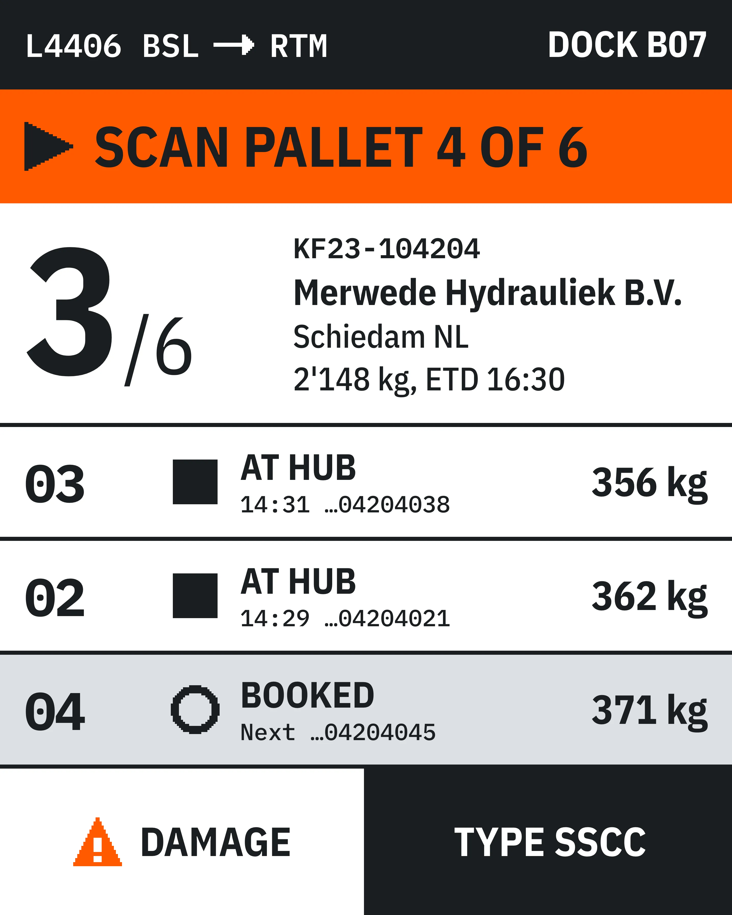
Each surface fails in a different way. Handhelds are used with gloves in loading bays with low sun, so anything under 56 px gets missed. Thermal printers have 8 dots per mm and one bit per dot, so a colour-coded status does not survive the label. Dispatchers wanted 40 rows on one screen and had 26.
No rewrite was allowed. There was no migration budget and no freeze on delivery, so every screen had to change inside a ticket that was already open for another reason.
Decisions
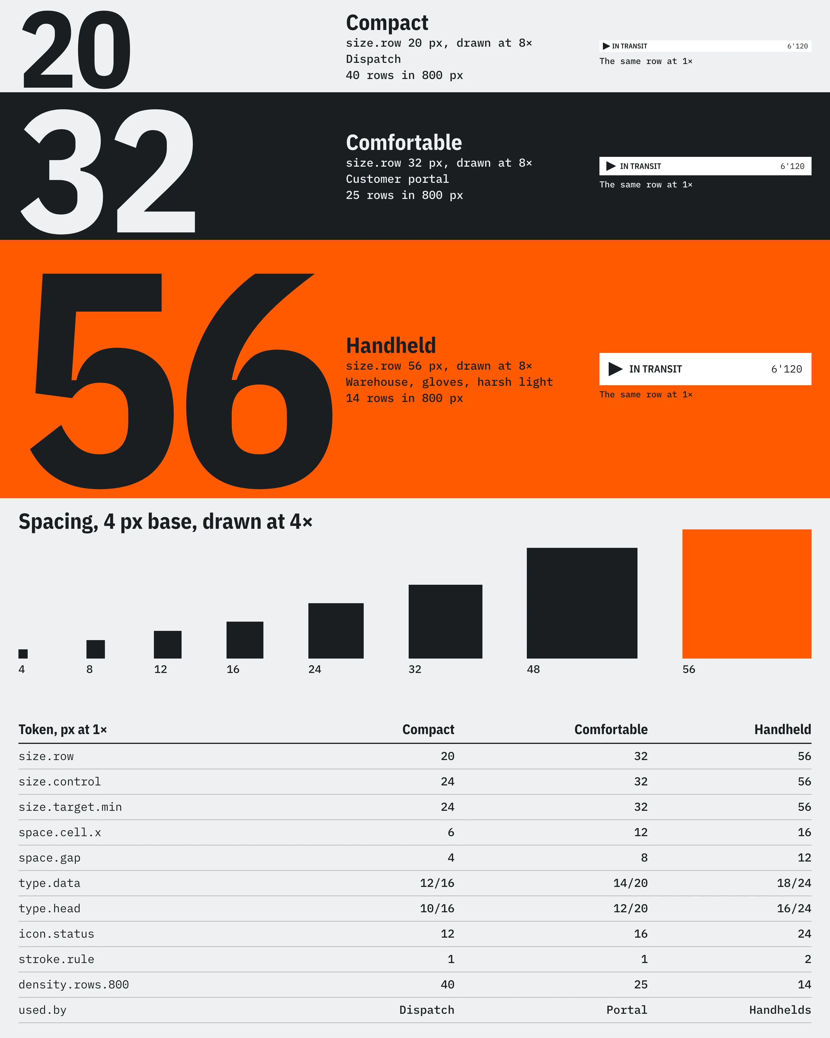
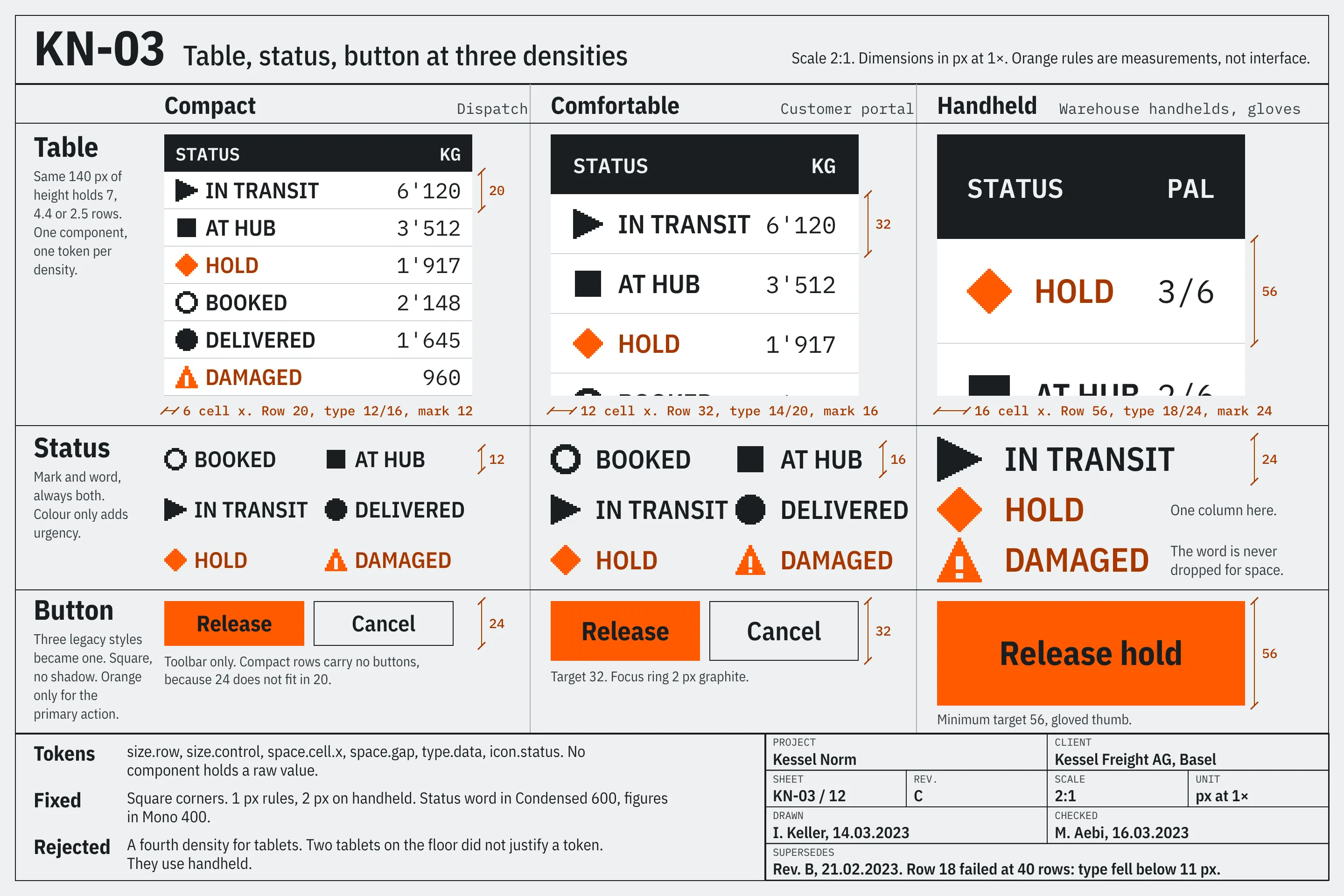
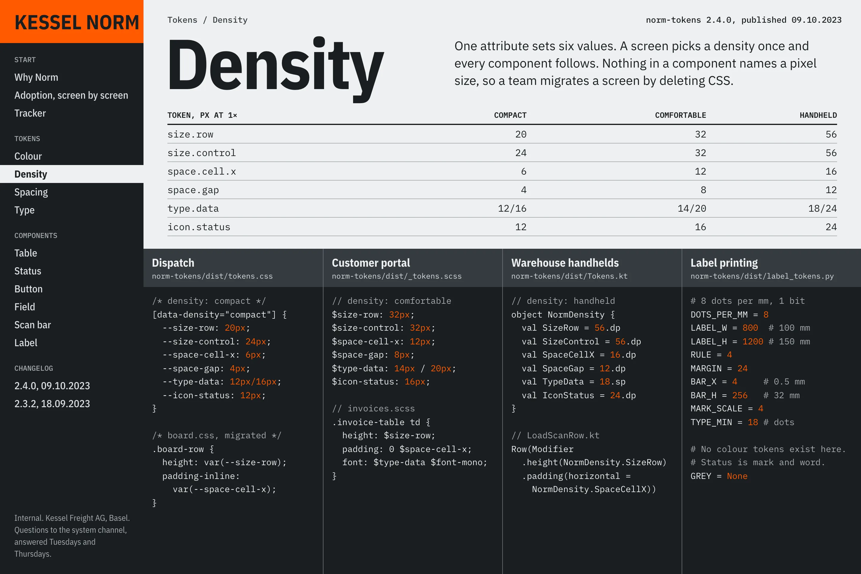
Density became a token. A screen sets compact, comfortable or handheld once, and row height, control size, padding, type and mark size follow. I tried a separate handheld library first and dropped it after two weeks, because the same table was being specified twice with different numbers.
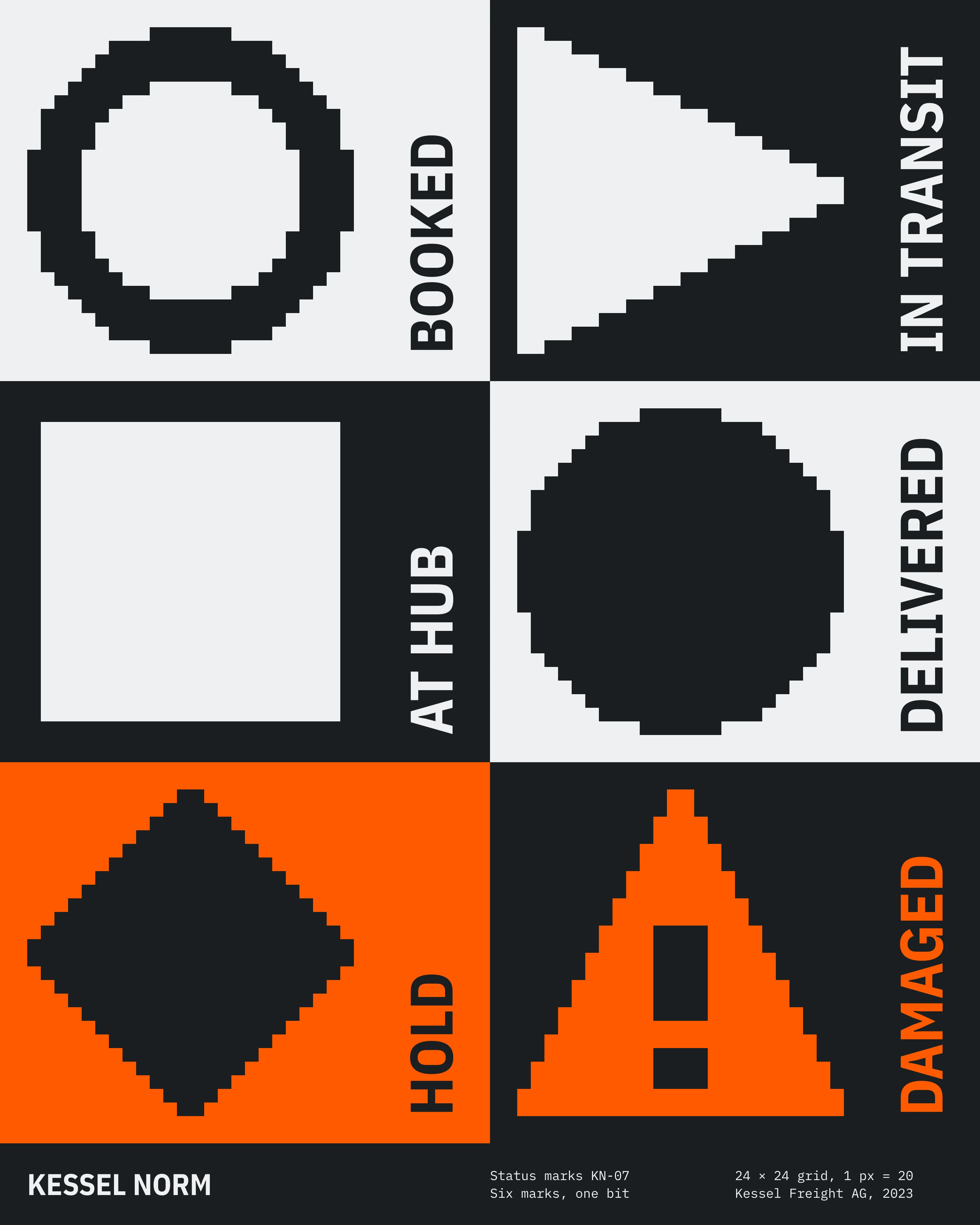
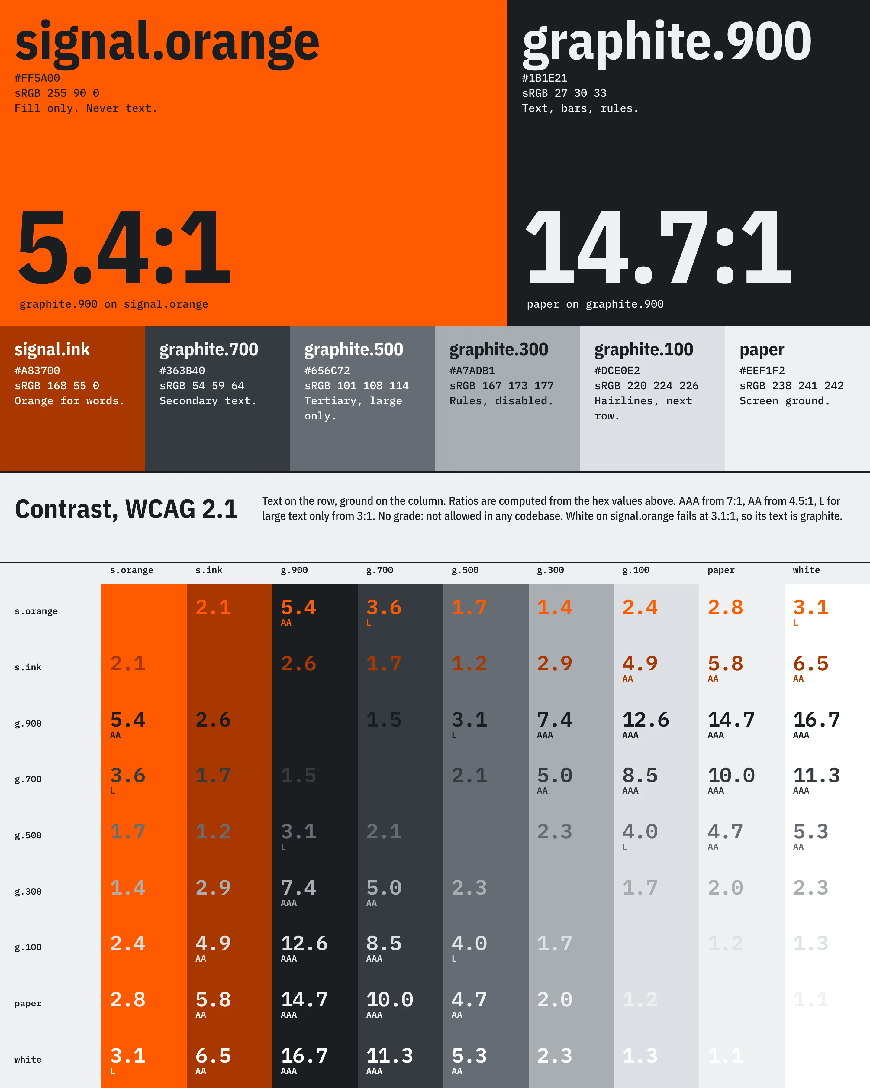
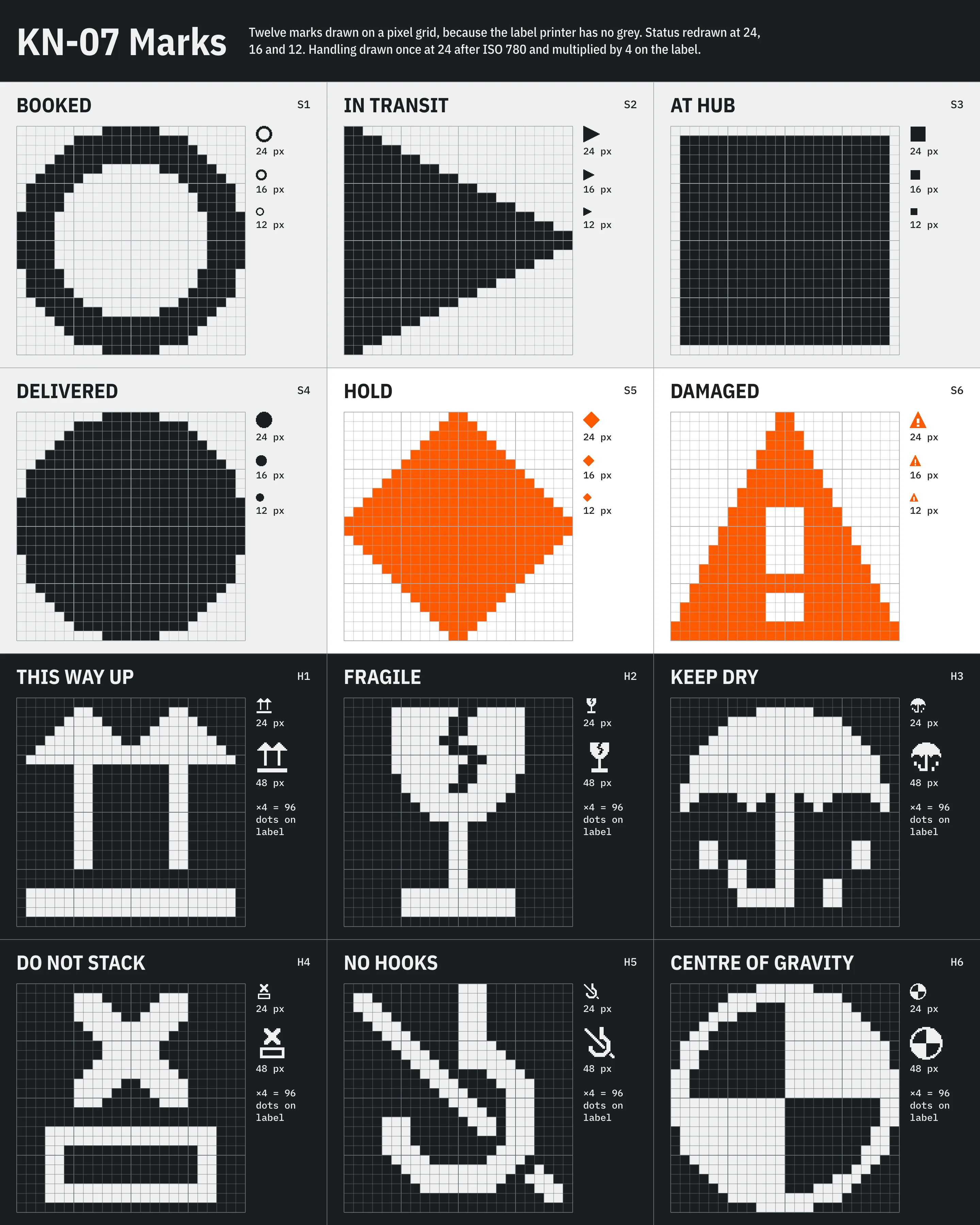
The status language starts from the worst output, the label. If a status cannot print as black dots at 12 mm it is not a status. So there are six marks, drawn on a pixel grid, each always paired with its word. Colour only adds urgency: orange is reserved for HOLD and DAMAGED, and the other four are graphite. White on orange fails at 3.1:1, so text on orange is graphite at 5.4:1.
One table
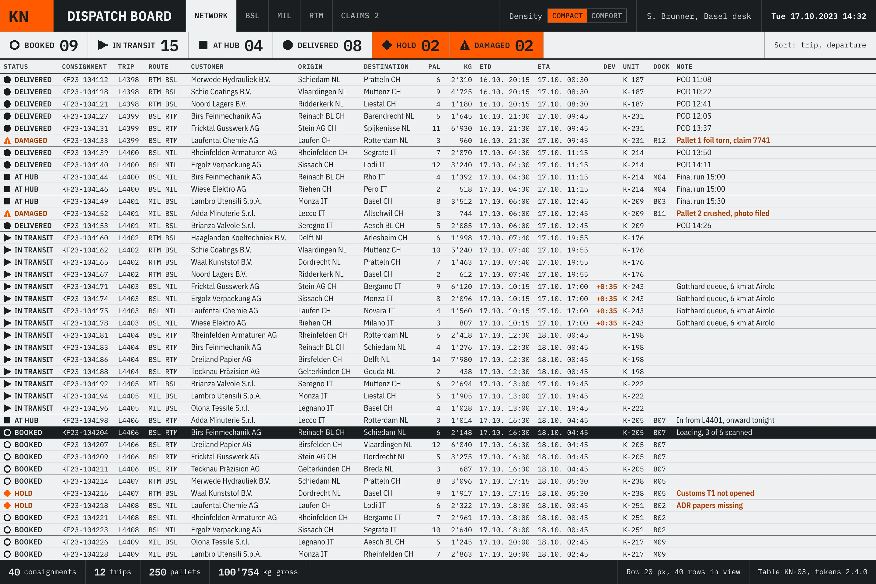
The audit found 37 screens that were a table with a toolbar, built five different ways. I put most of the design effort into one Table component and left forms for later. It carries sorting, grouping rules, status cells and tabular figures, and takes its numbers from the density token.
The first compact row was 18 px. It fit 44 rows, and the type fell below 11 px, so dispatchers zoomed the browser and lost the gain. At 20 px it holds 40 rows with 12 px type, which was the request. Rev. B of the sheet records the failure.
Adoption
Tokens are published to the four codebases as CSS, SCSS, Kotlin and Python from one source file. I rejected a shared component library across all four, because the stacks have nothing in common and the handheld team would have been waiting on web releases.
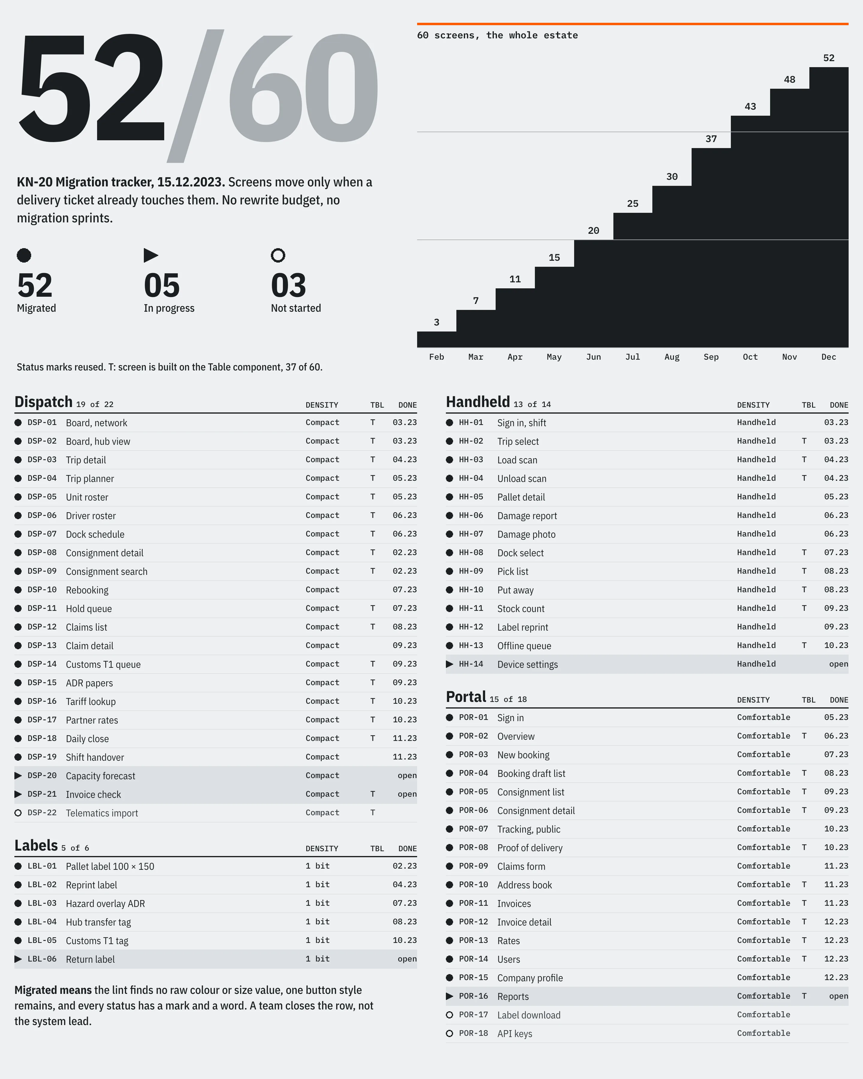
A screen moves when a delivery ticket already touches it, and the team closes the row itself once the lint finds no raw colour or size value. The tracker uses the status marks for its own states. Three screens have not started: telematics import, label download and API keys. Nobody has had a reason to open them.
“We stopped phoning the dock to ask what a red row meant. It says HOLD now, on the board, on the scanner and on the pallet.”
Result
By 15 December 2023, 52 of 60 screens had moved, with no rewrite and no migration sprint. Missed taps on the load scan screen fell from 1 in 14 to 1 in 61 between the February and October handheld logs. The dispatch stylesheet went from 214 kB to 38 kB, mostly by deletion.
The handling marks are still weak at 24 px on screen. They were drawn for the label at 96 dots, and I would redraw three of them if I went back.
- 52/60
- Screens migrated in eleven months
- 40
- Rows in view on the board, up from 26
- 37
- Screens built on one Table component
- 1
- Button style, down from three
Credits
- Design
- Ines Keller
- Token pipeline and dispatch
- Marco Aebi
- Handheld engineering
- Tomasz Wrona
- Customer portal
- Giulia Ferrante
- Label printing
- Pieter de Graaf
- Dispatch research
- Sandra Brunner