Specialty food packaging
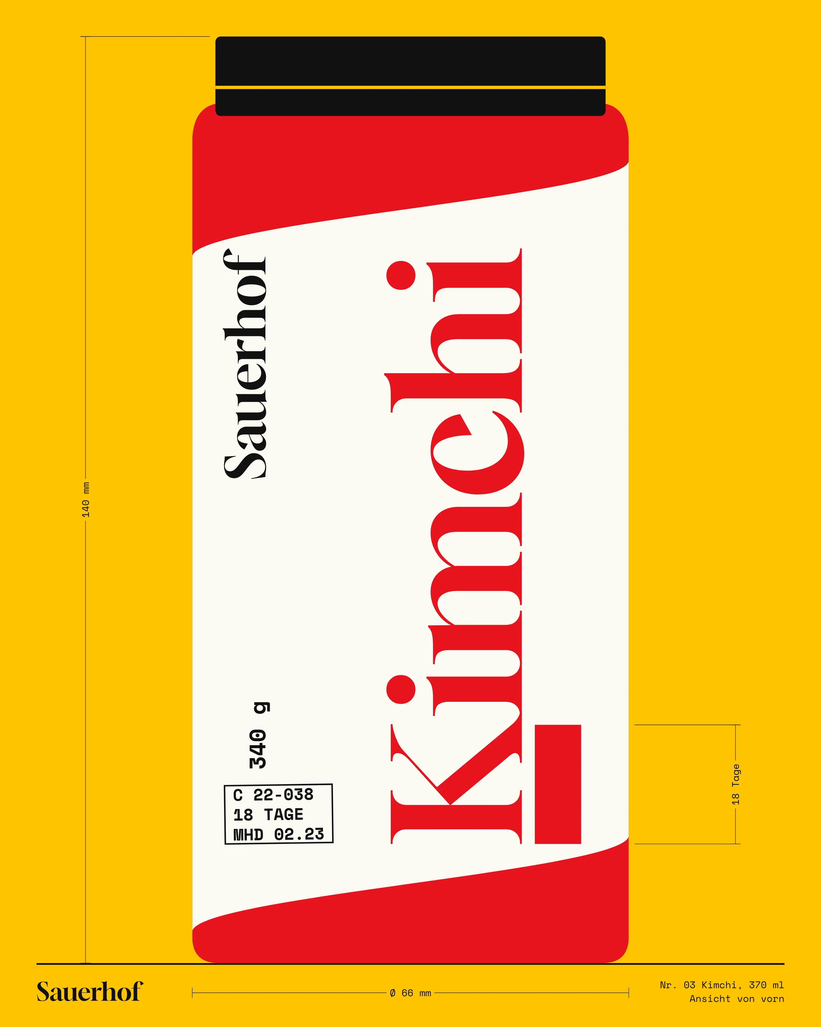
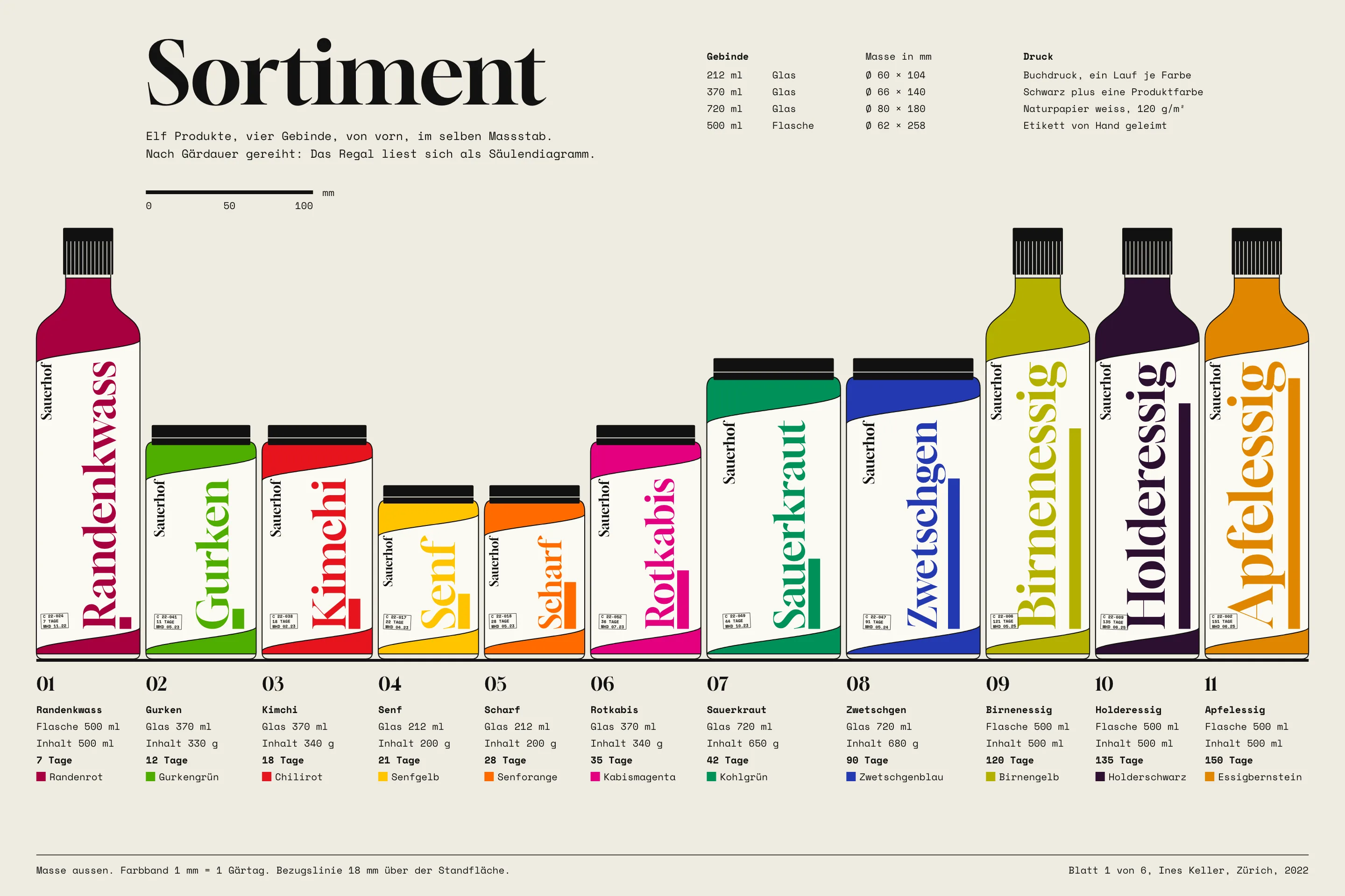
Labels for 11 fermented foods from a Thurgau farm: vertical names, one ink each, and a colour band where 1 mm equals one day of fermentation.
Brief
Sauerhof is a small farm near Weinfelden in Thurgau. Mirjam Oettli ferments what the farm and its neighbours grow: mustard, sauerkraut, kimchi from Swiss cabbage, beetroot kvass, vinegars and pickled plums. Eleven products. Until 2022 they sold at markets with handwritten labels, which was fine at a market, where Mirjam could explain everything herself.
She wanted to sell through delicatessens, where nobody explains anything. The buyers she spoke to already stocked plenty of brands with kraft paper and a line drawing of a cow. She did not want to be the next one. Neither did I.
Constraint
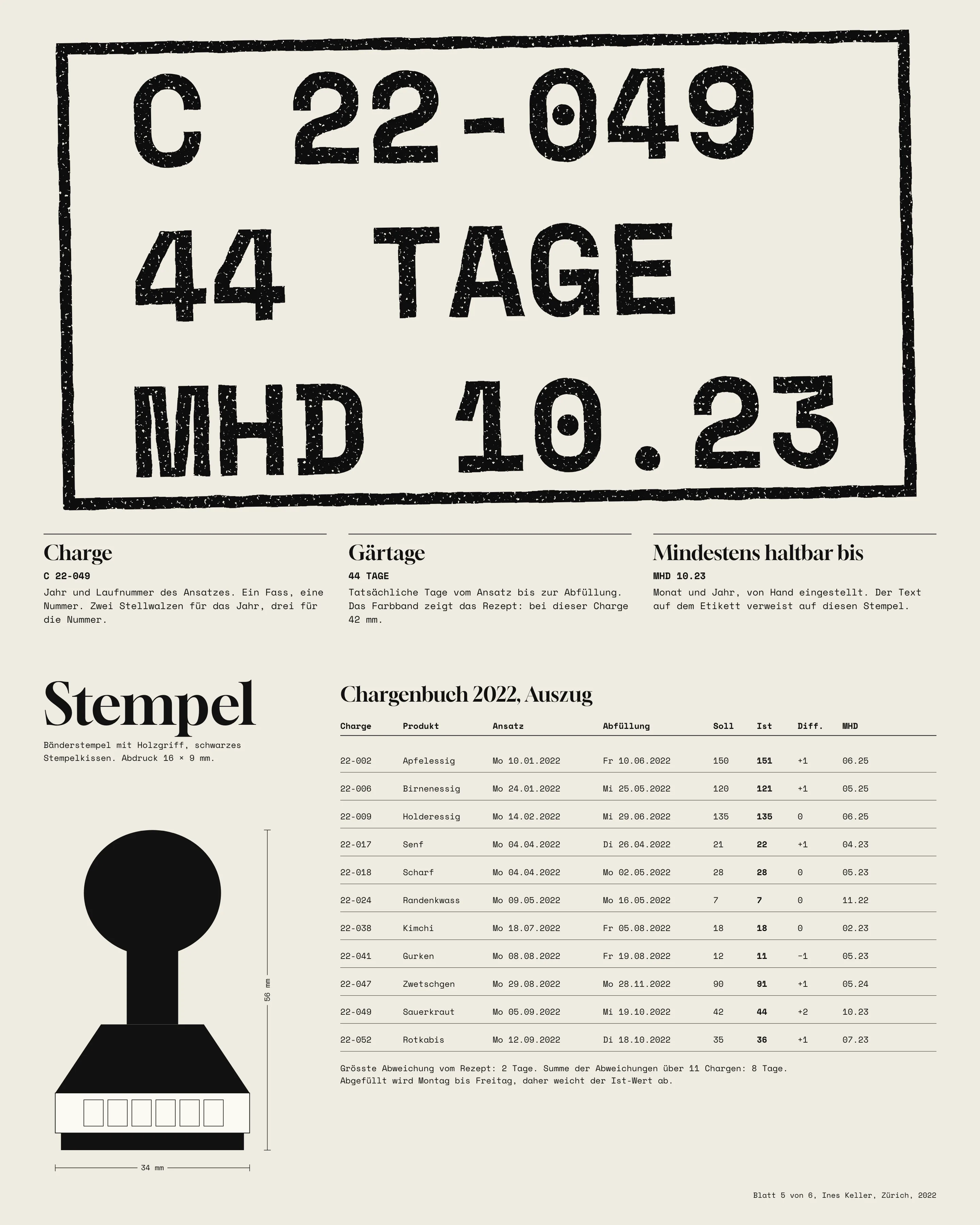
Labels are printed on a platen press in Frauenfeld, 34 × 46 cm, one colour per run. Batch number, fermentation days and best-before date are stamped by hand on the farm. Three jar sizes and one bottle, and the 212 ml jar has about 54 mm of usable front.
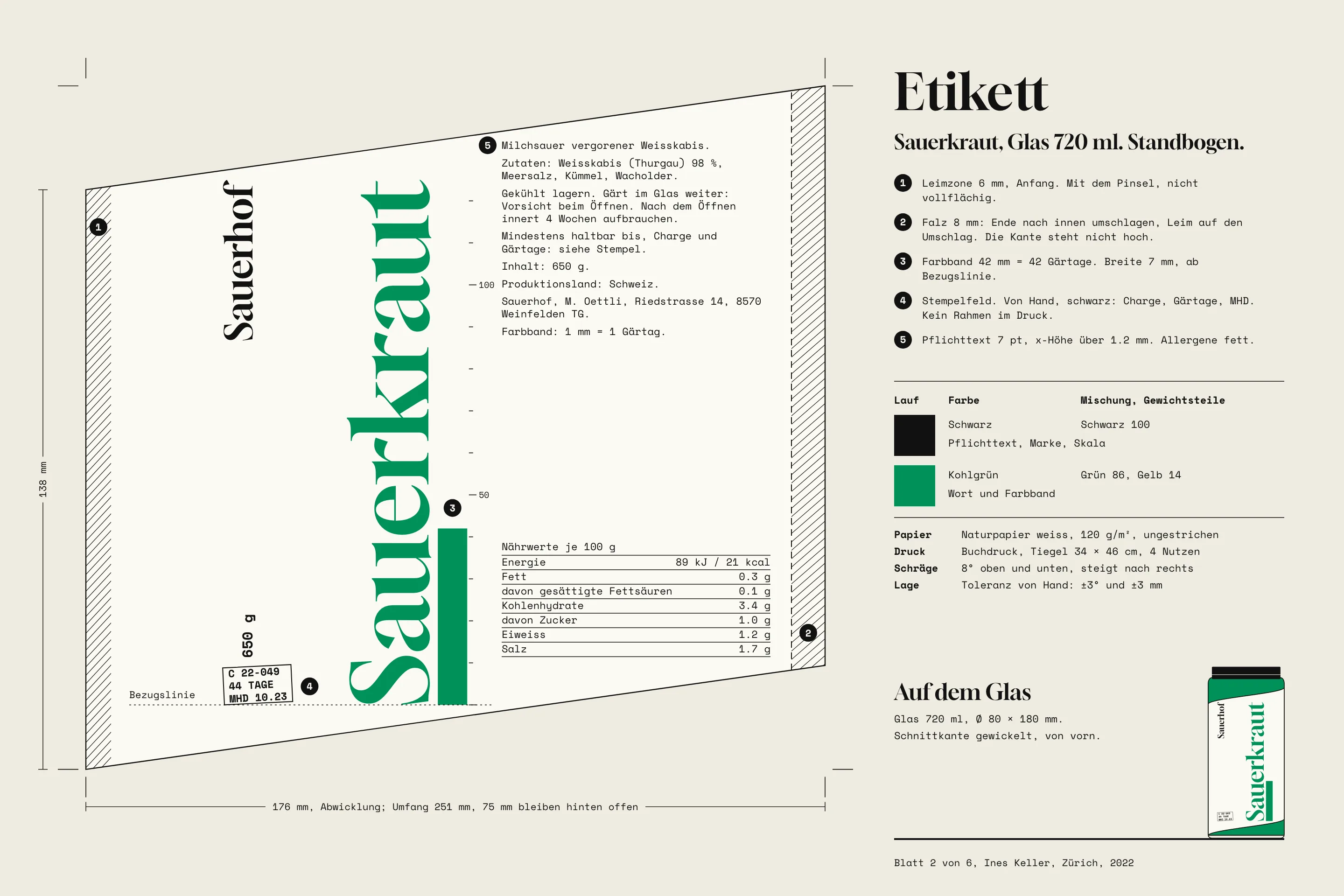
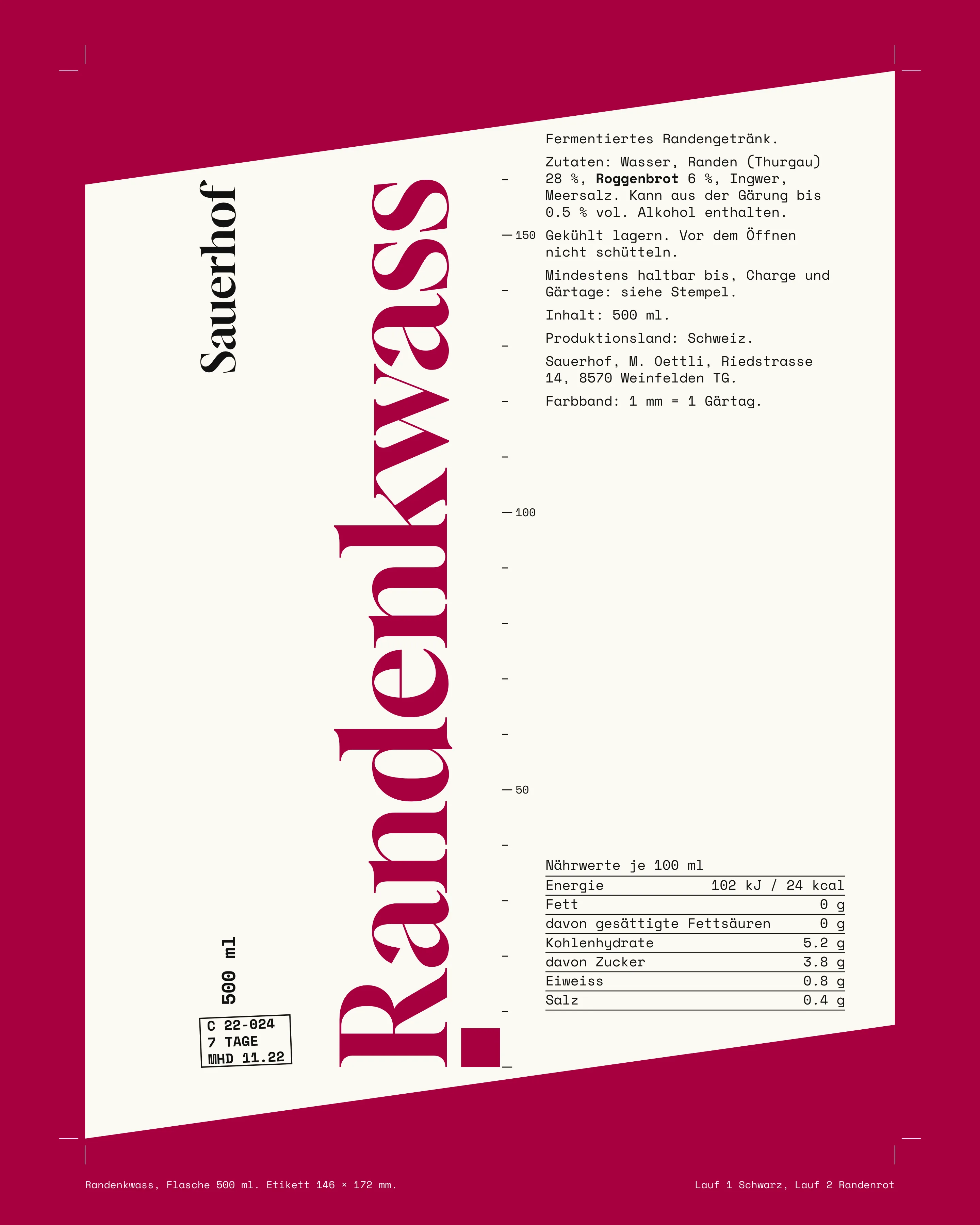
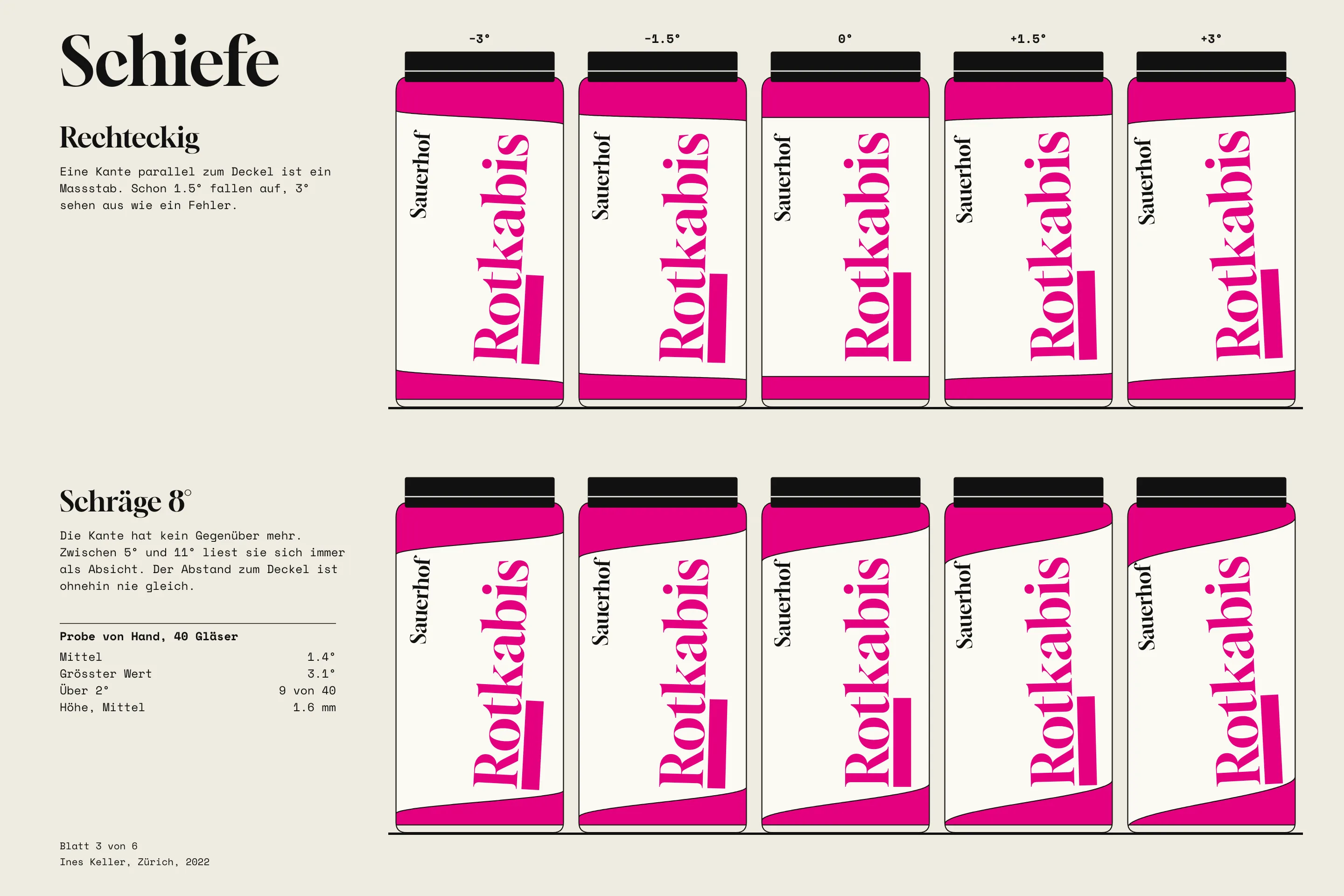
Swiss food law asks for ingredients, allergens in bold, net weight, best-before date, producer address and country of production. That is a lot of 7 pt on a small jar. The labels are also glued on by hand, usually by Mirjam and her son on a Friday. Before I started, I watched them do 40 jars and measured: mean skew 1.4°, worst 3.1°, and 9 of the 40 over 2°.
Decisions
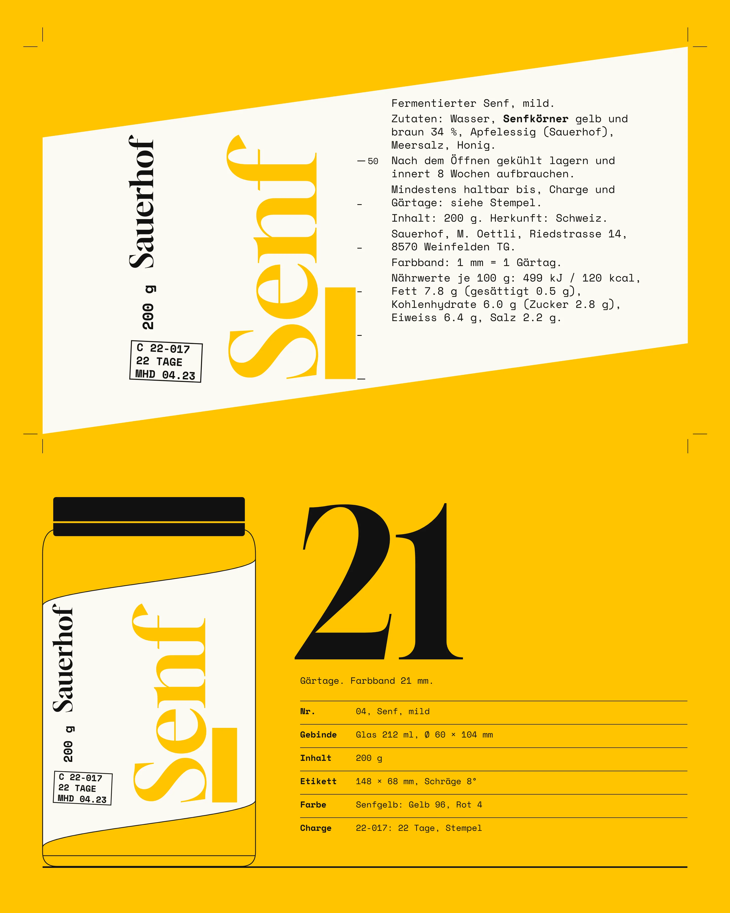
Names first. Set horizontally across the front of a 720 ml jar, "Sauerkraut" fits at a type size of about 13 mm. Turned 90° it runs 125 mm and the size doubles, and every label has room for it. It reads upward, as German book spines do. Each word is fitted exactly to its label height, so short names get big and long ones get smaller, and a shelf of them starts to look like a wall of type. I tried breaking compounds over two lines, Sauer and kraut. It filled the jar better and was slower to read, so I dropped it.
Ink. I wanted one colour per product, and I wanted that to be the whole label. Then I set the mandatory text in the mustard yellow. It was unreadable, and 7 pt in a light ink is not something to argue about with a cantonal inspector. So each label has two runs: black for the legal text, brand and scale, and one product ink for the word and the band. The printer mixes each ink by weight from the recipe on the sheet. Rotkabis is magenta because that is the colour red cabbage turns in acid.
Label shape
An edge parallel to the lid is a ruler. It shows every degree. I looked at pinked edges and deckle, which hide errors and also say artisan from three metres away. A round label just moves the problem to its centring. Training was not an option either: Friday is Friday.
What worked was removing the parallel. The top and bottom edges rake 8°. I tried 4°, which looked like the mistake it was meant to hide, and 14°, which cost too much height on the 212 ml jar. At 8° the same 3° error reads as a slightly different angle, not as a fault. The sheet also stops short of closing around the jar, 75 mm short on the 720 ml, so there is no seam to line up. One end folds under 8 mm so it does not lift.
Scale and stamp
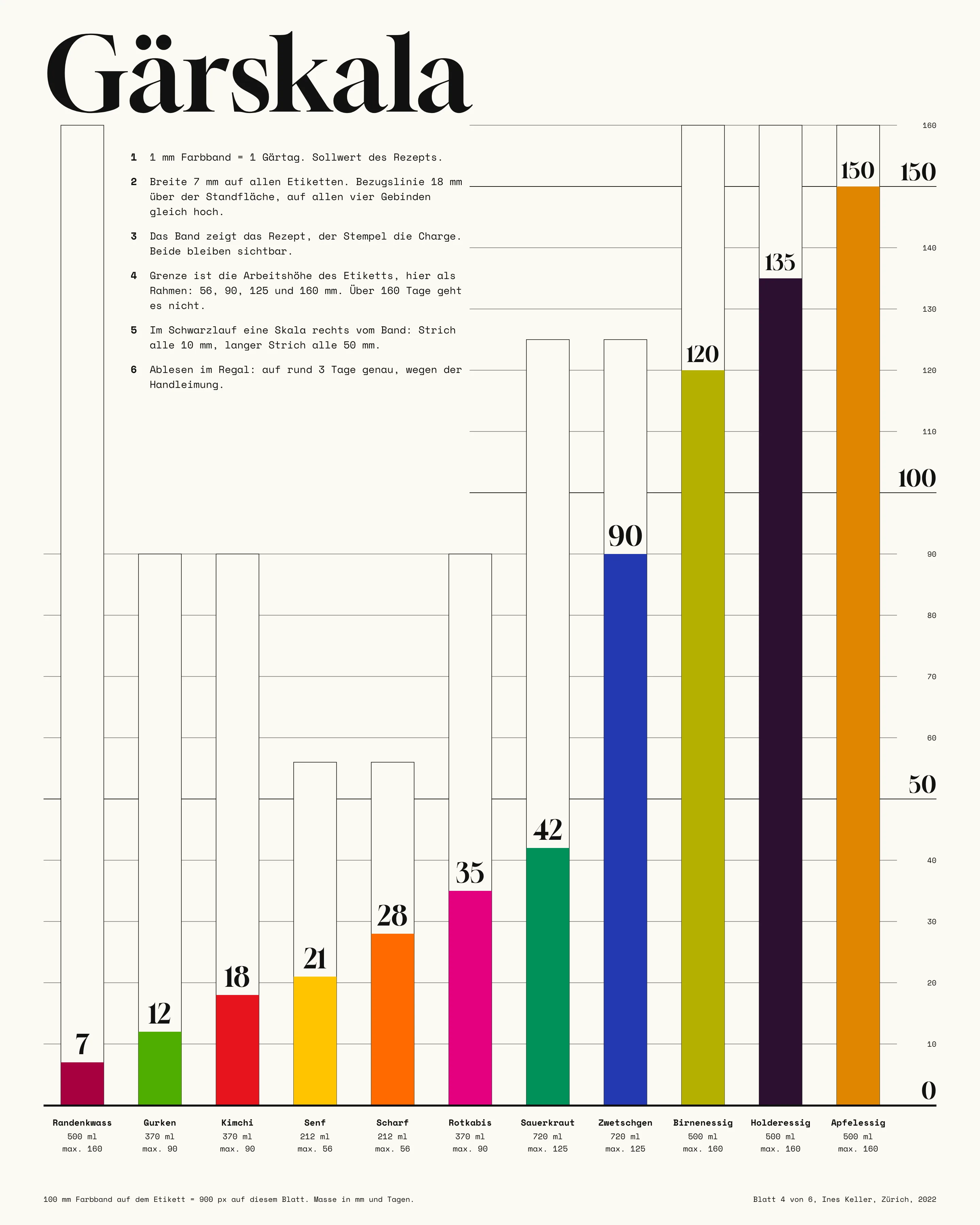
Fermentation time is what Mirjam actually sells, and it runs from 7 days for kvass to 150 for apple vinegar. So the label shows it as a length: 1 mm of band is one day, on every label, starting 18 mm above the shelf on all four containers. I tested a logarithmic scale because 150 mm is a long band. It fit better and made vinegar look about as patient as sauerkraut, which is the one thing the scale exists to prevent.
A printed band cannot know about a batch, so the band is the recipe and the stamp is the batch. Sauerkraut batch 22-049 took 44 days against a recipe of 42, and the jar shows both. Hand gluing means the shelf reading is only good to about 3 days. Nobody has complained, and I am the only person who has checked it with a ruler.
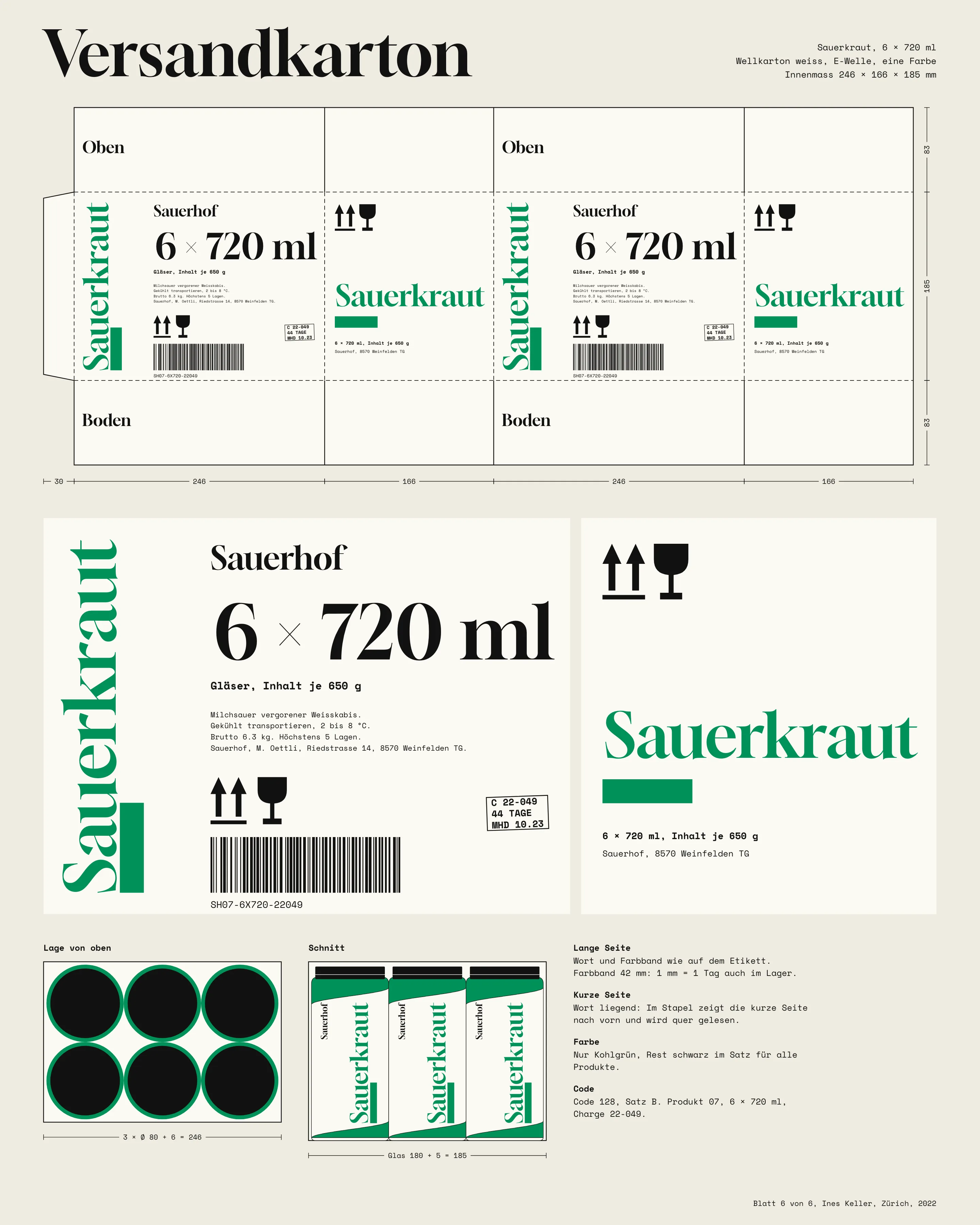
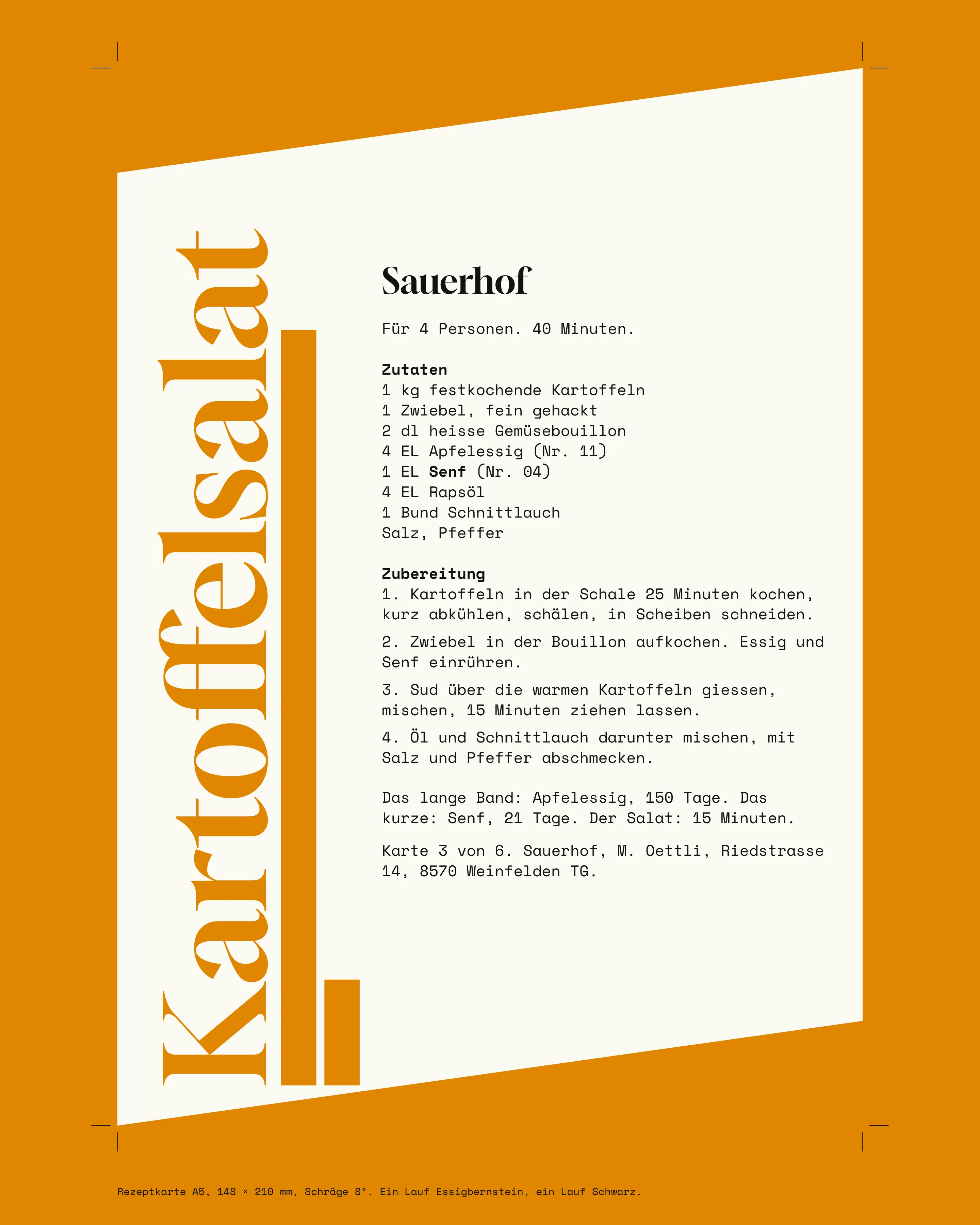
The same system runs through the carton, where the band keeps its scale, and the recipe cards, which print the bands of the products they use.
“At the market people asked what was in the jar. Now they ask why the vinegar has such a long stripe, and that is the conversation I wanted to have anyway.”
Result
The first full set was printed in March 2022, 500 labels per product. By the following spring Sauerhof was in 14 delicatessens in Zürich, Basel and St. Gallen, and shops now make up 31 % of sales, from nothing. Two of the buyers told Mirjam they put the range together on one shelf because it looks wrong split up, which was the idea.
Labels cost CHF 0.46 each including both runs, about CHF 0.15 more than the copy shop stickers they replaced. Mirjam considers that high and pays it. The weak point is Senf: yellow on white is the least legible word in the range at shelf distance. I would keep the ink and make the word larger if the jar ever changes.
- 14
- Delicatessens in the first 12 months
- 1 in 90
- Jars relabelled, down from 1 in 12
- CHF 0.46
- Cost per label, two runs
- 11
- Products on one 1 mm scale
Credits
- Design
- Ines Keller
- Letterpress
- Reto Wick, Frauenfeld
- Food law review
- Sandra Aepli
- Carton structure
- Luca Bont
- Recipes
- Hanna Frei